Because visitors browse your site on mobile phones, tablets, and desktops, you should ensure your boxes look great on all devices. Not only does this provide a better experience for your users; it can also help you increase form conversions, particularly for mobile visitors.
With the responsive width breakpoints in the Digioh editor, you can:
- Control exactly what your widgets look like at different screen sizes.
- Start from one design and create up to 4 versions of each widget.
- Modify each version independently by dragging and dropping form elements.
Watch the video for a quick overview of our responsive width breakpoints:
Note: responsive breakpoints are helpful if you want to show the same offer to users on all devices; however, if you want to display different boxes to visitors on particular devices, you can use our conditions editor to target visitors with a certain lightbox based on what type of device they use.
How to Use Responsive Breakpoints in Digioh
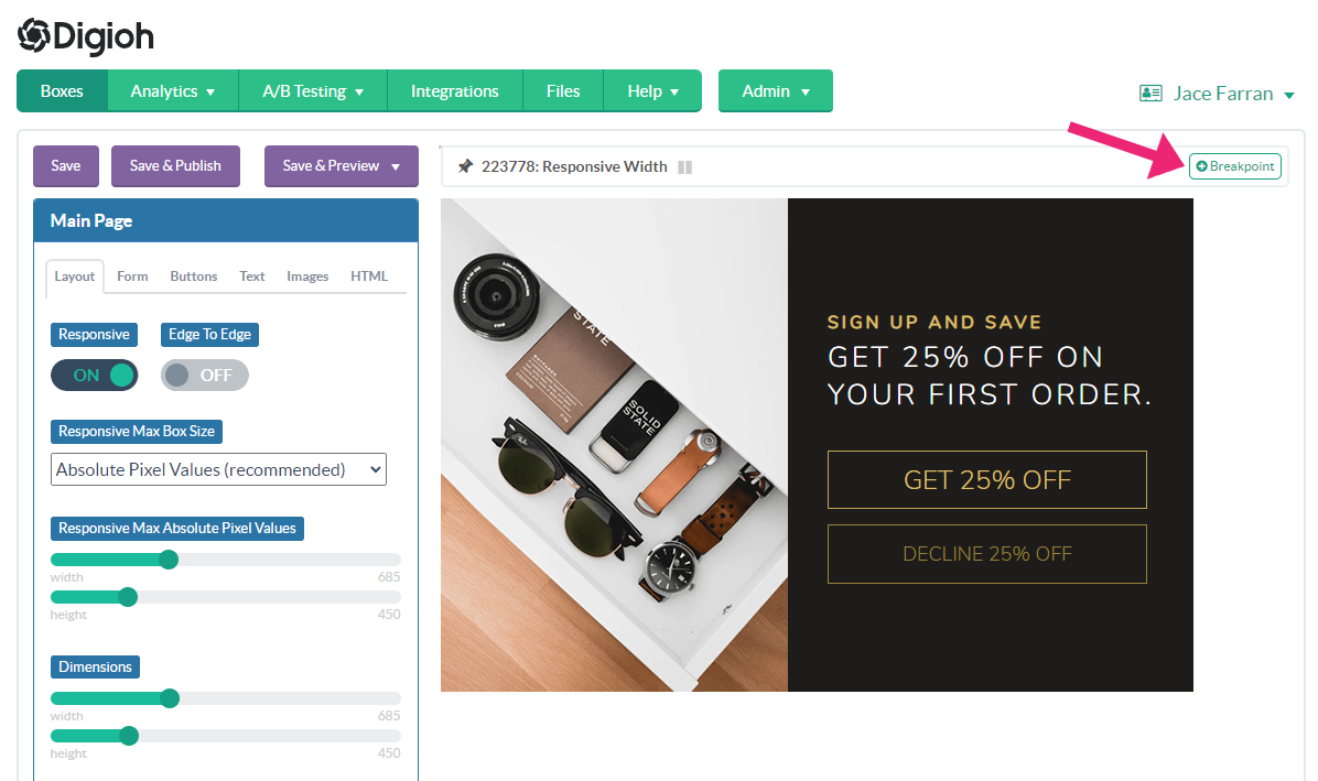
- To add responsive width breakpoints to a box, open the Editor and click the + Breakpoint button in the top-right corner:
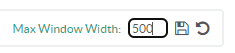
- Add the threshold pixel width (i.e., if the screen size is under this width, the custom variation will display). In this example, we’re creating a variation that displays at screen widths of 500 px or less. Save to start editing this variation.
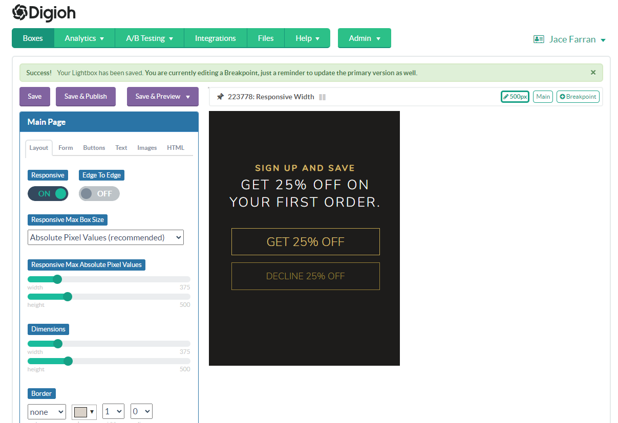
- Customize this variation by adjusting form dimensions and elements. This is what appears when the max window size is 500 px, so you want it to be smaller than that. The content itself in this example is 375 px wide, and will appear on any screen smaller than 500 px wide.
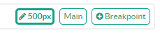
You can return to the original version at any time by clicking the “Main” button:
- Repeat Steps 1-3 to create other variations as needed. For example, if you create another breakpoint at 720 px, that box will display on screens between 500 px-720 px.
You can create up to 4 breakpoint variations of your boxes.
Breakpoint Size Tip:
If you’re not using responsive settings in your design, then your breakpoint’s max width needs to be at least as wide as the next design up. Your breakpoint won’t appear until the window reaches or goes below the max width. This is important if you’re using Edge to Edge settings.
For example, if your main design is 800 px wide, then your next breakpoint needs to have a 800 px max width.
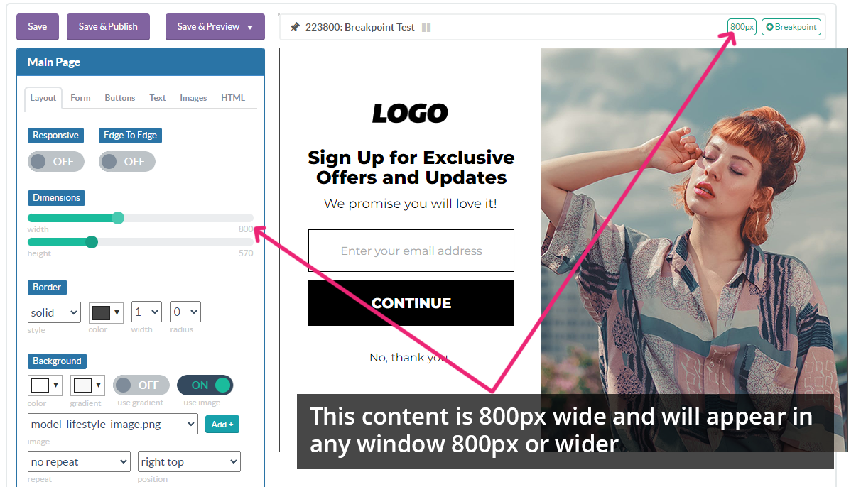
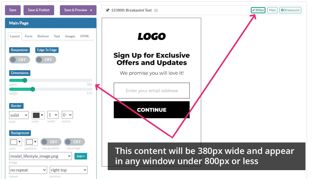
If the next break point’s max width is 800 px and the design is 380 px wide, it will appear normally in any window size between 380 and 800 px.
Have more questions about breakpoints or responsive design? Send us an email, and we’ll help you out!
Related Reading: