It’s important to design mobile-friendly widgets and lightboxes. There are 3 ways to create mobile-friendly designs. Which choice you make depends on your goals and needs.
- Responsive Settings, great for simple designs.
- Breakpoints, a good idea if your desktop version is wide and has lots of small text or details that wouldn’t resize well. We recommend setting your mobile breakpoint’s max width to 515px.*
- Separate mobile design, perfect for separate stat tracking for mobile and desktop users, and suggested if you’re using a lot of custom CSS in your design.
*The 515px breakpoint is great for responsive designs, however if your design isn’t responsive, the breakpoint should be set to the same width as your desktop design so nothing cuts off when you switch. For example if you have a 1000px wide Edge to Edge design, you want to make your breakpoint also 1000px wide so once your screen is smaller than your current design, the breakpoint gets loaded.
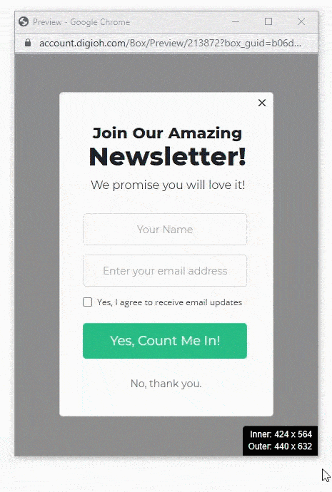
Recommended Dimensions for Mobile
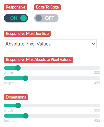
Screen sizes vary across mobile devices, but we recommend making your mobile designs between 300 x 400 and 375 x 667.
For more information, see our Recommended Widget Dimensions help doc.
Think Big
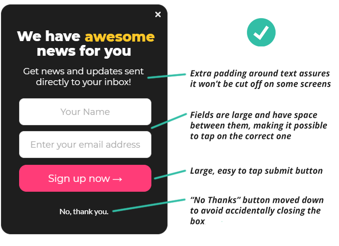
Since mobile users see your website on a smaller screen, the design must be easy-to-read, and forms should be easy to complete on a touch screen.
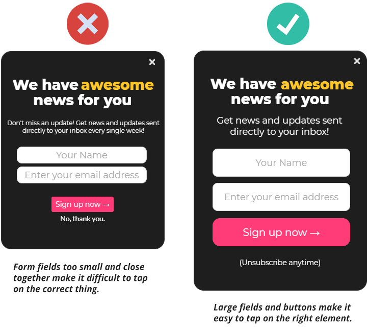
Create large buttons and fields that are easy to tap. Try not to make any elements too close together or too small to tap easily.
Room to Breathe
Be mindful of text that is too close to the edge of the design. It might cut off on some devices.
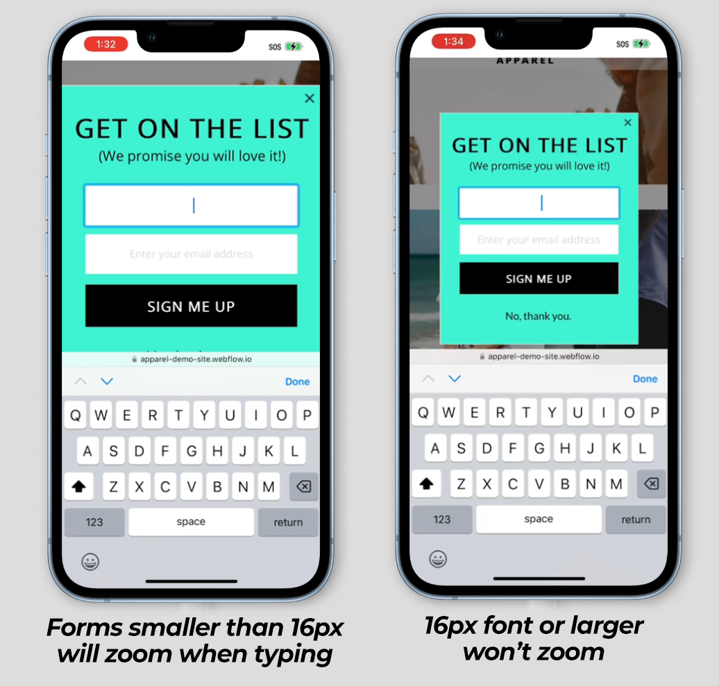
Keep Form Input Text 16px or Larger
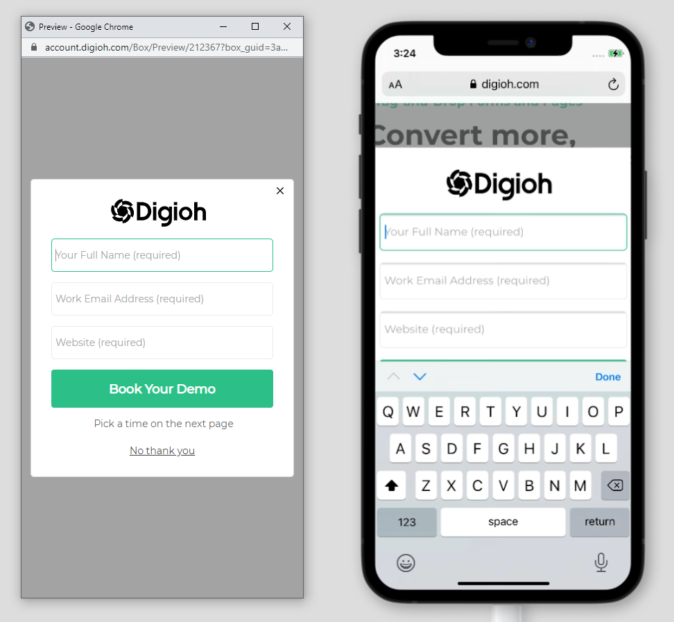
If you want to avoid auto-zooming on iPhone when you tap on an input field, your font needs to be set to 16px or larger.
For touch screen users, we recommend making your mobile buttons the full width of your form.
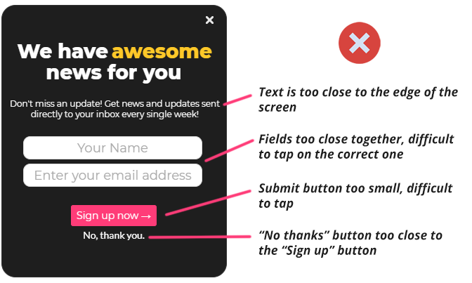
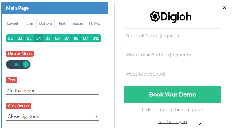
Easy-to-Tap Close Buttons
Close buttons are notorious for being too small or hard-to-find on mobile. Some devices zoom in when you tap forms, making the mobile button impossible to reach. While the zoom is useful for filling out forms, you don’t want to block visitors from seeing your site.
In the example below, the close “x” in the top-right corner cuts on some devices.
Making a box slightly narrower than your screen size helps. But the most reliable way to make sure your widget can be closed is to add a “no thanks” button in the center of your widget, under the form. That way, there’s no missing it.
Responsive Mobile Designs
Even if you create a separate box for mobile visitors, it’s a good idea to make that box responsive.
Since every device is different, the best way to guarantee that your mobile designs will work is responsive design. That way, no matter the screen size, your box will fit.
For more information on Responsive settings, read our Responsive Settings help doc.
Testing
Lastly, we highly recommend testing your mobile boxes on a mobile device, not just a resized browser window. This provides the most accurate results.