What You’ll Learn
- Best practices for sizing when designing your desktop and mobile campaigns.
- Implement responsive design principles to adapt your widgets to diverse screen sizes.
Whether you want a subtle sidebar or a large popup, you can design that with Digioh’s form builder.
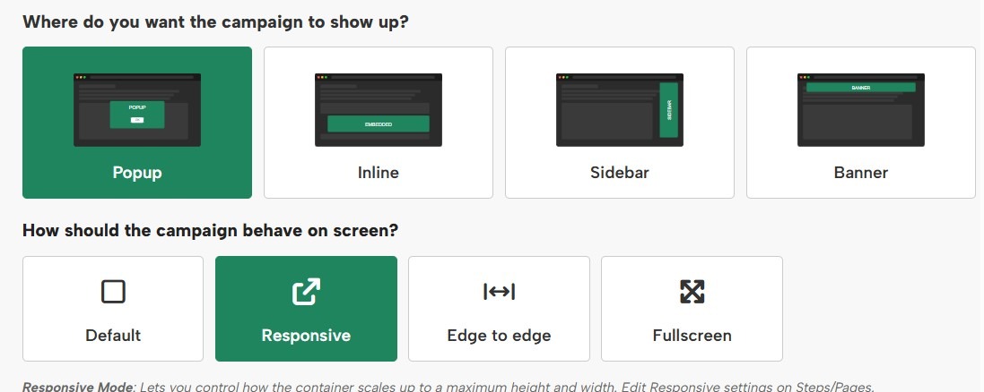
Campaign Size Best Practices
There’s no exact “right” size for design. But as a starting point for a basic popup, sidebar, inline or banner, we recommend these dimensions:
-
- Popup
- Desktop: ~800×600
Recommended max width: 900px
Recommended max height: 650px
Screen Size setting to show mobile should be equal to the width of desktop - Mobile: 360×660
Recommended max width: 360px
Recommended max height: 660px
- Desktop: ~800×600
- Sidebar
- Desktop: 340×200
Recommended max width: 500px
Recommended max height: 500px
Screen Size setting to show mobile should be equal to the width of desktop - Mobile: 340×200
Recommended max width: 360px
Recommended max height: 360px
- Desktop: 340×200
- Inline
- Desktop: 800px wide, any height
Recommended max width: 1000px
Recommended max height: 700px to keep content above the fold
Screen Size setting to show mobile should be equal to the width of desktop - Mobile: 360px wide, any height
Recommended max width: 360px
Recommended max height: 620px to keep content above the fold
- Desktop: 800px wide, any height
- Banner
- Desktop: 800×60
Recommended max width: 1000px
Recommended max height: Any height, but for traditional top banners it’s best to stay under 120px.
Screen Size setting to show mobile should be equal to the width of desktop - Mobile: 360×60
Recommended max width: 360px
Recommended max height: Any height, but for traditional top banners it’s best to stay under 120px.
- Desktop: 800×60
- Popup
If you have Responsive settings turned on for a popup or sidebar, these numbers matter a little bit less, but if you’re using Edge to Edge or Scrolling, they matter a lot.
Below, we share some more detailed size guidelines.

Desktop Popup Sizes
Digioh makes designing a popup for desktop users easy with our responsive design settings. Choose any dimensions, then turn on responsive design, and your pop-ups will automatically resize to fit any window.
Around 700×500 looks good!
Popup design varies, but for a pop-up centered on your website, a size of around 700×500 looks pretty good.
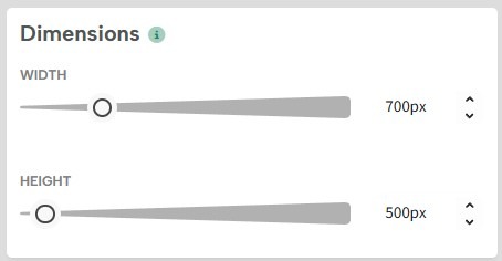
Here’s a preview of a 700×500 popup on a 1366×768 window: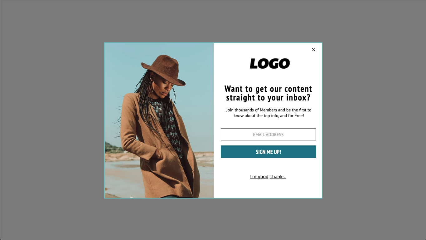
Recommended Max Size: 900×650
To design something that looks good at most resolutions, it’s a good idea to stay under 900×650.
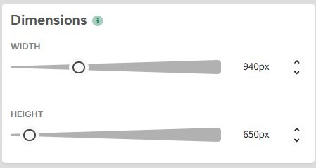
1366×768 is a common screen resolution, and some people still even use 1024×768. So 768 seems like a good number to stay under for height. To account for the address bar, bookmarks bar, and taskbar, etc., staying under 650 pixels for the height of your pop-up is probably your best bet.
Still, this isn’t a hard rule.
Here’s a preview of a 900×650 popup on a 1024×768 window: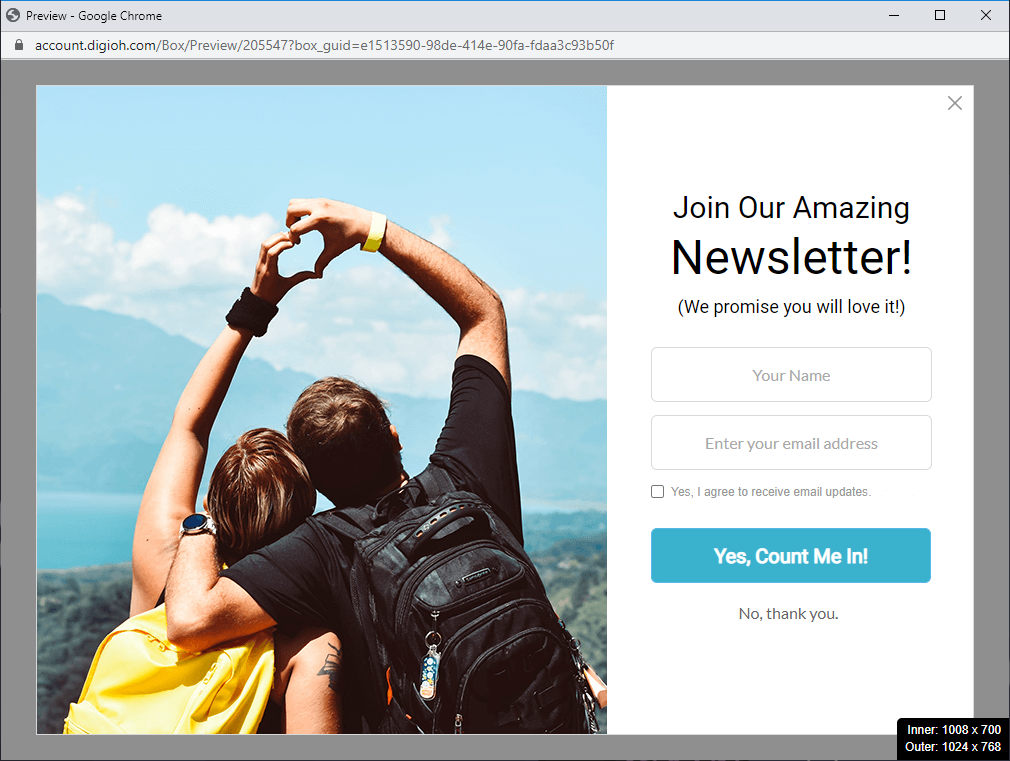
Responsive Design on Desktop
There’s no way to predict every screen resolution or whether your visitors will view your website in a full-screen window. To guarantee that your popup fits any window, you can turn on responsive design in the campaign settings.
This automatically resizes your popup or sidebar based on the size of the window.
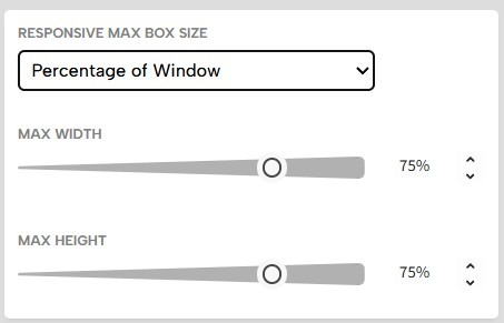
To learn more about responsive settings, see our help doc here.
Here is an example of a 900×650 popup with the max width and height set to 75%, viewed in a 1024×768 window: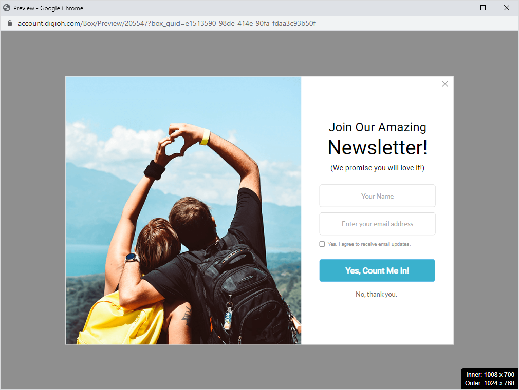
Desktop Sidebar Sizes
Sidebars appear next to your content, so generally, these should be slightly smaller than a popup.
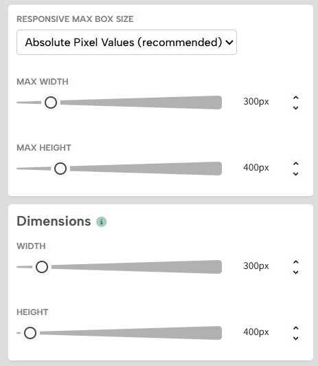
We recommend starting with a sidebar between 300×200 or 375×250. Experiment with sizes and layouts that look good on your website.
Smaller sidebar designs look good with the position set to Center Left or Center Right. They appear relatively high on the page, so they grab attention without covering your content.
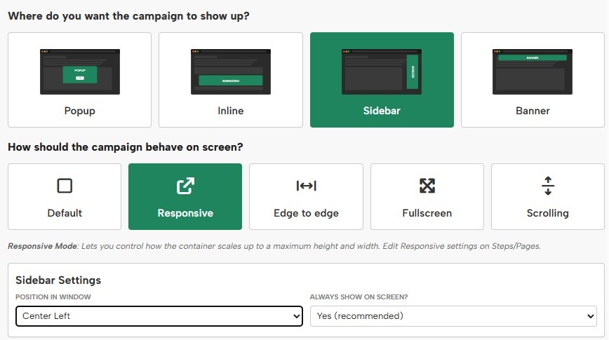
Here is an example of a 340×200 sidebar with the position Center Left, viewed in a 1024×768 window: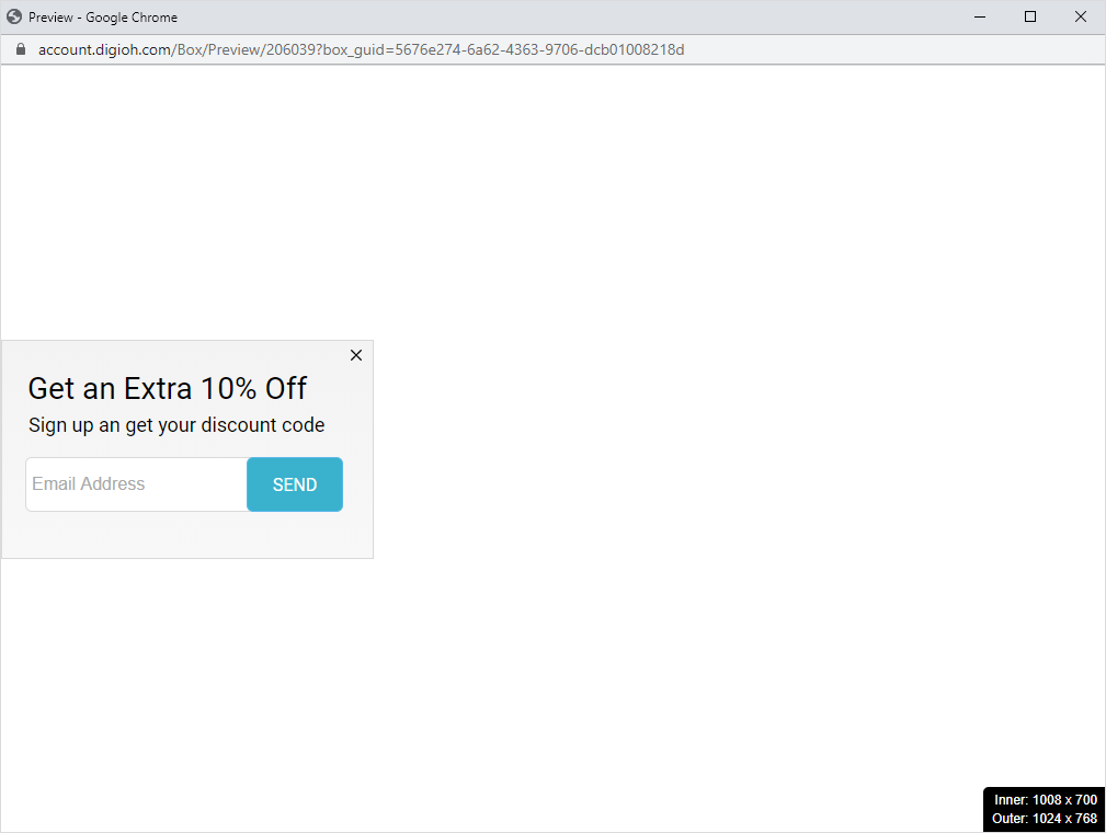
If you want to add more details or images and make a slightly larger sidebar, we recommend using a Bottom position.
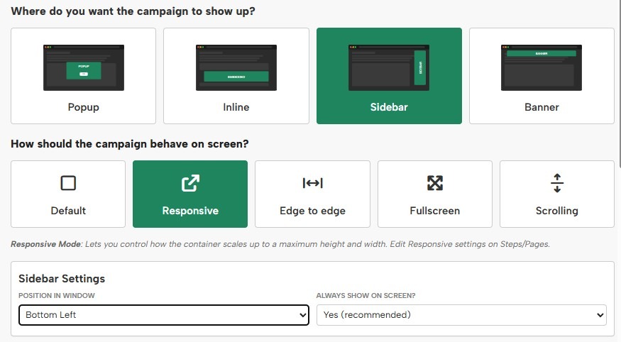
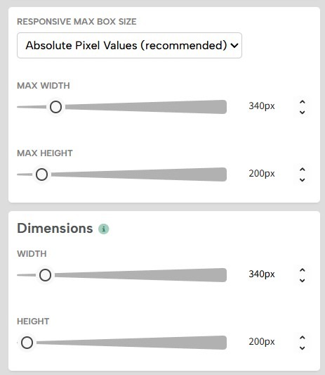
Here is an example of a 375×250 sidebar with the position Bottom Left, viewed in a 1024×768 window: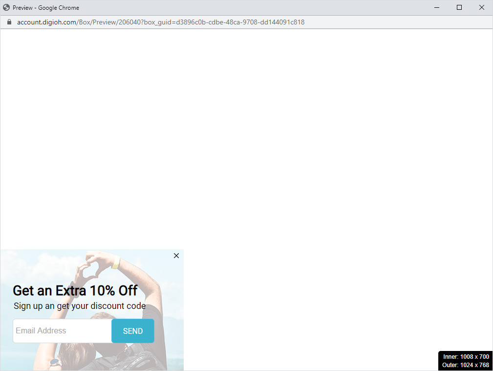
Mobile Popup Sizes
Every mobile device is a little different, but 360×660 or smaller is a good size for mobile popups. This will fit on every mobile device without cutting off.
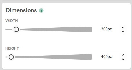
Here is a preview of a 300×400 mobile popup design: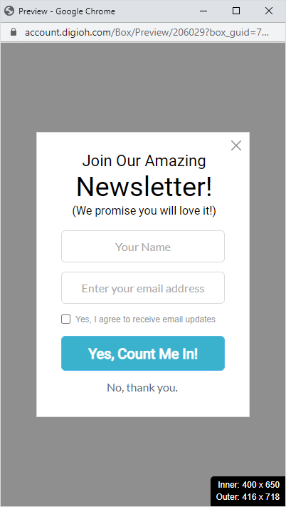
Responsive Design on Mobile
Since some devices such as Android have a viewport as small 360px pixels wide, you can turn on responsive design and set your max pixels to the dimensions of your popup.
Mobile dimensions can get as large as 514px wide, so if you’re using Screen Sizes, we recommend setting your mobile Screen Size max-width to match the desktop width or to 515px if using responsive settings.

The popup will resize down in smaller resolutions but won’t exceed that size in larger ones.
Mobile Sidebar Sizes
If you use the recommended sizes for desktops, your sidebars will probably also work on mobile devices. But to be on the safe side, make sure you turn on responsive design under campaign settings:
Here is a preview of a mobile popup sidebar: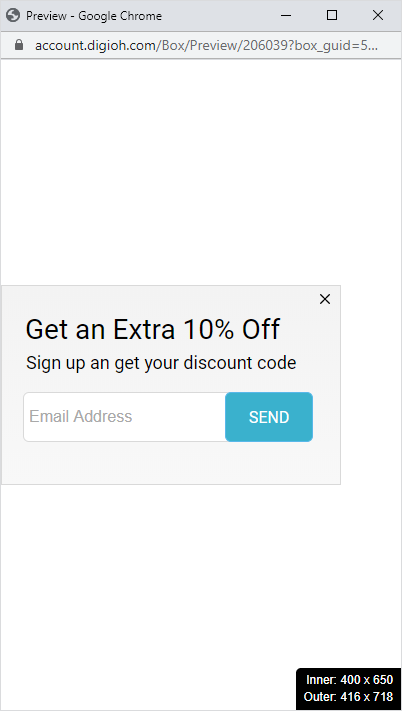
For more help designing your mobile campaigns, please see our Mobile Design Best Practices.
For additional details of Full Screen Popups, see our help doc here.