Recommended Dimensions for Mobile
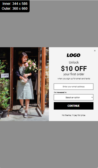
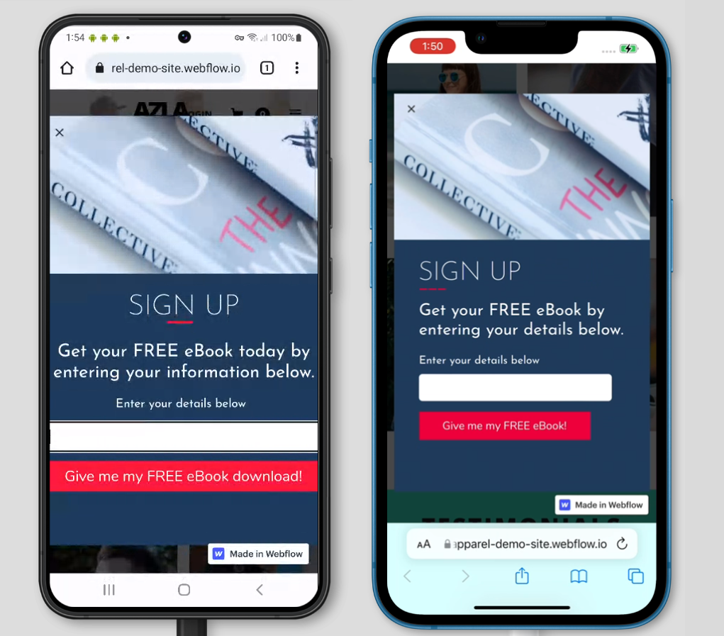
Screen sizes vary across mobile devices, but we recommend making your mobile designs around 360px wide and 660px tall.
For pop-ups, we recommend turning on responsive settings to ensure your design fits any screen size or device.
For more information, see our Recommended Dimensions help doc.
Mobile Screen Size Settings
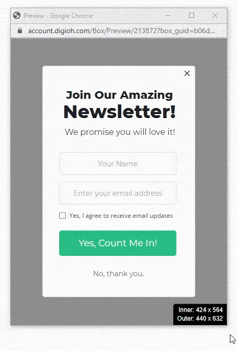
If your pop-up design has an aspect ratio that doesn’t scale well on a mobile device, we recommend creating a mobile Screen Size design. While a 16:9 aspect ratio works great on desktop designs, mobile pop-ups should be optimized for 9:16.
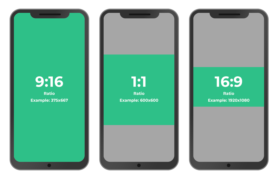
In this example, the original pop-up design is 800px wide x 600px tall and is too difficult to read when scaled down to fit on a mobile screen.
By creating a mobile screen size, you can create a design with an aspect ratio that works better on a mobile device.
The mobile screen size design in this example is 360px x 600px, which doesn’t have to be scaled on mobile devices and is easier to read.
Recommended Mobile Screen Size Width
When creating a mobile screen size, you must set the Max-Width of that screen size. This isn’t how wide your design is, but the widest screen or window width that will show your screen size before switching back to the desktop version.
- Best practice is to set the max-width to be equal to the desktop design width.
- If your design is Responsive: 515px or larger
- If your design is Edge to Edge: The same width as your desktop design or larger
- For example, if you are using Edge to Edge and your desktop design is 800px wide, your screen size’s max-width should be 800px or larger
- If your design is using the Full Screen feature:
- Centered Full Screen: The same width as your desktop design or larger
- Left or Right Image Full Screen: Depending on the image % this can vary, but you will need to calculate the size of your desktop dimensions with the addition of the image.
- Example: If using 50% image and your desktop design is 500px, that means your design will need to switch to mobile at 1000px to ensure nothing is cut off.
- See our Full Screen help doc for more details
For more information on how to create screen sizes, read How to Use Responsive Width Screen Sizes.
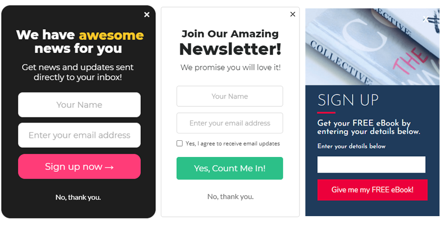
Large, Easy to Tap Buttons and Fields
Since mobile users see your website on a smaller screen, the design must be easy-to-read, and forms should be easy to complete on a touch screen.
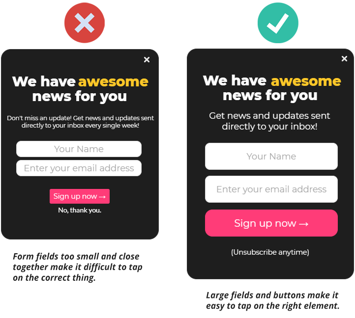
Create large buttons and fields that are easy to tap. Try not to make any elements too close together or too small, so they are easier to tap.
Give Your Design Room to Breathe
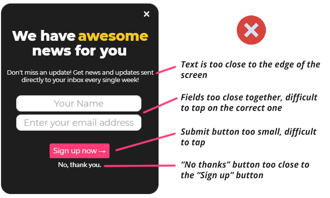
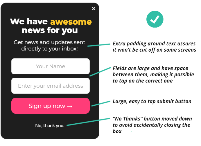
Be mindful of placing your text too close to the edge of the pop-up. It might cut off on some devices, especially on newer mobile phones with curved screen edges.
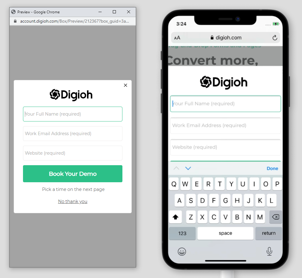
Keep Form Input Text 16px or Larger
If you want to avoid auto-zooming on iPhone when you tap on an input field, your form’s input font needs to be set to 16px or larger.
Zooming can cause some elements of your pop-ups to appear off-screen, including close buttons or important text.
Easy-to-Tap Close Buttons
Close buttons are notorious for being too small or hard-to-find on mobile. Making a campaign slightly narrower than your screen size is a good place to start.
But the most reliable way to make sure your widget can be closed is to also add a “no thanks” button in the center of your widget, under the form. Even if your close button gets cut off, there’s still another way for users to close the pop-up.

Responsive Mobile Designs
While it’s important to account for common screen sizes and device types, the guaranteed way to make sure your pop-up fits on every device is to make it responsive. With responsive settings turned on, your pop-up will resize to fit any window or screen size.
In the Digioh editor, go to Settings > Campaign Settings and for “How should the campaign behave on screen?” select “Responsive”.

Click “Apply & Close” and go back to the Layout tab of the editor to configure the Responsive Window Settings.
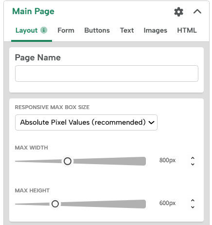
We recommend using “Absolute Pixel Values” which will let you set the maximum height and width of your design. If the screen resolution goes below that size, your pop-up will scale down and adjust to fit. However, if the screen resolution is larger than the Absolute Pixel values, your design won’t scale up any larger.
Preview and Test
Always double-check what your pop-ups look like in a preview window and make sure you resize the window to simulate a mobile screen’s height and width.
But keep in mind that just previewing a pop-up in a desktop window won’t give you the full mobile experience. We recommend using the preview on live site feature:
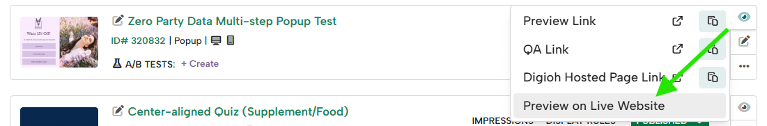
Once you have the preview link, load it on your mobile device to see the pop-up live on your device.