What You’ll Learn
- Add a code that creates a button that, when hovered over, displays a hidden tooltip.
- Customize tooltip content
- Modify the CSS styles within the style tags to adjust the appearance of the tooltip, such as its width, font size, and colors.
Tooltips are a simple way to provide additional context or guidance to visitors without adding clutter to your campaign design. In this article, you’ll learn how to add a tooltip to any Digioh campaign using basic HTML, allowing you to display helpful hover or tap-based messages on icons, text, or other elements inside your campaign. This approach is ideal for short explanations, definitions, or hints that enhance the user experience without requiring custom JavaScript.
Adding a tooltip to a Digioh campaign
1. Add a new HTML block.
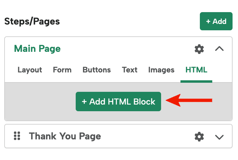
2. Add the following code:
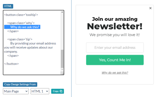
<button type='button' class='tooltip' >
<span class='why'>Why do we ask this?</span>
<span class='tip' >
By providing your email address you will receive updates about our company.
</span>
</button>
<style>
.tooltip {
text-align: center;
background-color: transparent;
border: 0px !important;
width: 280px;
color: #666666;
font-size: 14px;
}
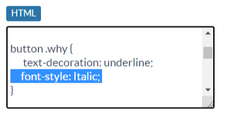
button .why {
text-decoration: underline;
font-style: Italic;
}
button .tip {
display: none;
}
.tooltip:hover .why {
display: none;
}
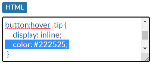
.tooltip:hover .tip, .tooltip:focus-visible .tip {
display: inline;
color: #222525;
}
.tooltip:focus-visible .why {
/* visually hidden, still readable by screen readers */
position: absolute !important;
width: 1px !important;
height: 1px !important;
padding: 0 !important;
margin: -1px !important;
}
</style>
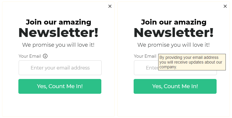
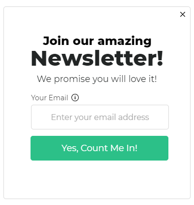
That will give you results like this:
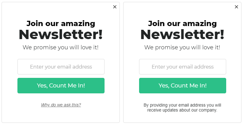
3. Edit the text and style.
You can change settings like the width, font size, etc under “.tooltip” in the style section.
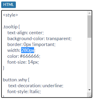
You can edit the style of the default text under “button.why”
You can edit the tip text that’s visible when you mouseover or tap the area under “button:hover .tip”
And to edit the text itself, you can edit the text in between the brackets. The span with the “why” class appears first, and the span with the “tip” class appears on mouseover.
Optional: Using an image for a tooltip.
To use an image, just replace the default text with an image reference:
<span class='why'>
<img src='https://s3.lightboxcdn.com/vendors/906a5d64-2cda-407f-a2d5-6cf94c06ddbe/uploads/274a7932-a0fd-4a89-9f58-a83cc44112ca/info.svg' width='15' height='15' aria-label='tool tip -' />
</span>
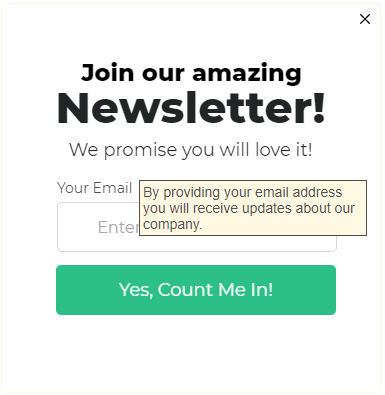
Optional: Add a campaign around the tooltip.
Use the following CSS to add a background color and border to the tip. Make sure you also add a width.
.tooltip:hover .tip, .tooltip:focus-visible .tip {
display: block;
color: #514f4e;
background: #fff8e2;
padding: 3px;
border: 1px solid #514f4e;
width: 220px;
margin: 0 auto;
}