What you’ll learn:
- Why exit intent pop-ups are effective
- Best practices for crafting and designing exit intents
- Most effective targeting rules for exit intents
Showing an exit-intent pop-up to visitors about to leave your site gives you one last shot to keep them engaged. We have a few tips for setting up an effective exit-intent pop-up.
Exit Intent Can Drive Traffic To Your Quiz
55% of first time visitors leave in the first 15 seconds. Exit Intent Pop-Ups are a great way to drive traffic and show an offer to these visitors (like a chance to take a quiz and find the perfect product recommendation for them).
Start with a Strong Offer or Alternative Path
They’re already on their way out the door; make sure you give them a reason to stay. Free shipping offers, percentage-based discounts, and one-time-use coupon codes work great. We also recommend promoting your Quiz – a chance to find exactly what they are looking for.
Make Your Pop-Up Stand Out
Your visitors will see this pop-up when they move to leave your site, so it’s important to make sure you catch their eye. We recommend a light pop-up on a dark background, that is on brand (leverages your custom fonts and colors). This helps draw the visitor’s eye to the pop-up.
Keep It Simple
The pop-up should only include one button, and that button should have a call-to-action, like “Get Free Shipping Now”, “Save 10% Now”, or “Find the Perfect Product by Taking our Quiz”.
The Thank-You Page
After they enter their email, thank them and remind them to check their email for their incentive. Your Thank-You page might say something like “Thank You! Your free shipping coupon is waiting in your inbox!”
NOTE: While you can show the coupon code on the Thank-You page, it’s a good idea to send it in an email. That way, you can be sure visitors enter a valid email address.
Use The Right Targeting Rules

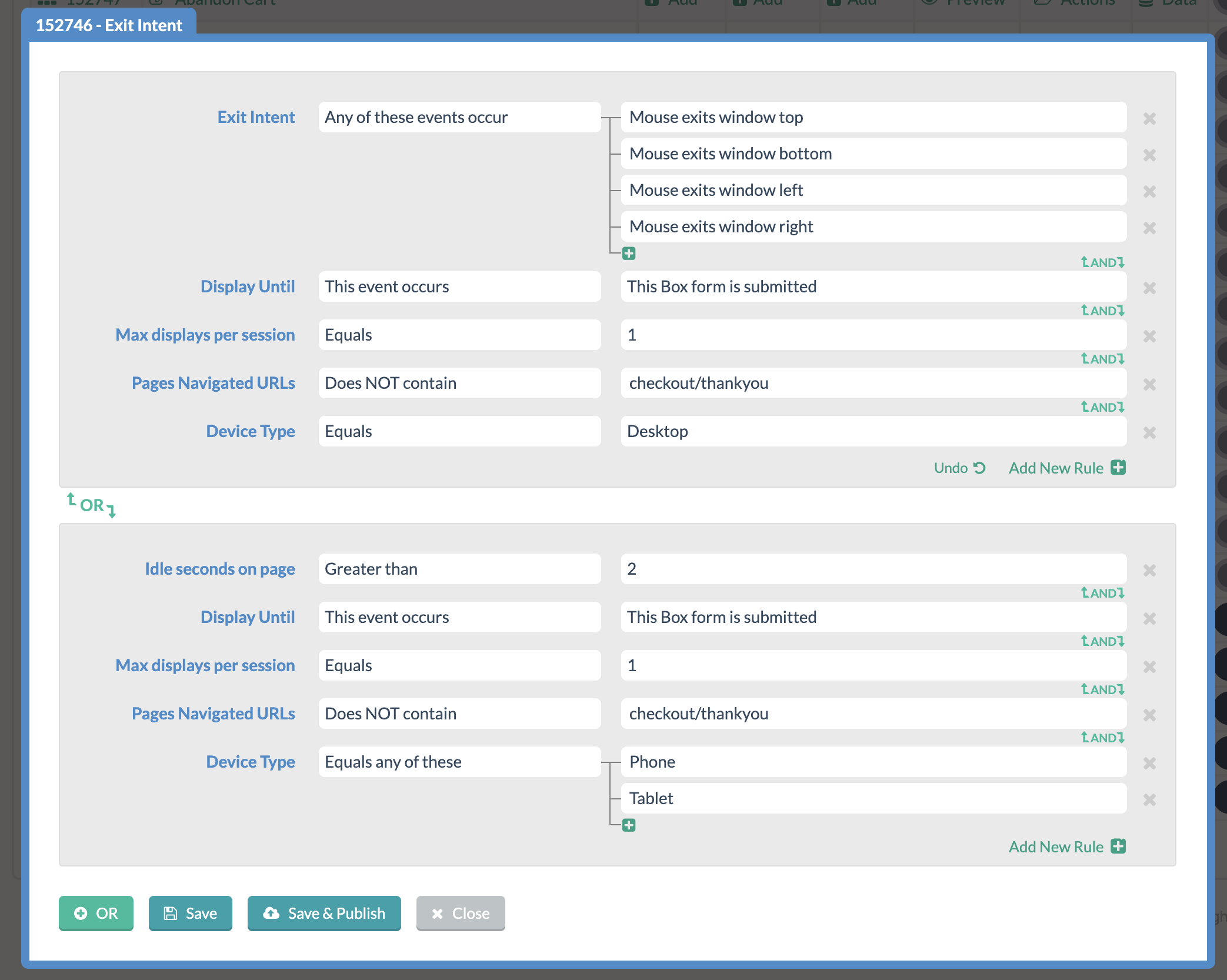
Make sure you show this pop-up at the right time. The screenshot above shows our recommended set of rules for an exit-intent lightbox on Desktop and Phone/Tablet.
- The exit-intent rule is set to show the pop-up whenever the visitor moves their mouse out of the window in any direction.
- The device type rule ensures this will only show to visitors browsing from a desktop or phone/tablet. We want to use “Exit Intent” (which tracks mouse movements for Desktop. We want “Idle Seconds on Page” for phone/tablet, which will wait 2 seconds if you stop scrolling up and down with your finger when you are on a mobile device.
- The max displays per session rule ensures visitors only see on box once per session. This prevents them from seeing the same box multiple times.
- The pages navigated URLs rule can also contain anything you like, but we strongly recommend excluding your “thank you” page. If the visitor has already checked out, there’s no need to show them the lightbox.
These rules will work for a lot of different scenarios, but we know everyone’s needs are different. If you want help getting the most out of your exit-intent pop-up, feel free to contact us, and we’ll be glad to help!
