
What You’ll Learn
In this guide, you’ll master the essentials of creating and customizing landing pages and preference centers using Digioh’s intuitive drag-and-drop builder. By following these steps, you’ll be able to:
- Select and apply themes to serve as the foundation for your page design.
- Effortlessly add and arrange elements like text, images, buttons, and forms.
- Customize your page’s appearance to align with your brand identity.
- Ensure your page is has a mobile-optimized version
Our drag-and-drop landing page builder allows you to quickly create custom landing pages and preference centers.
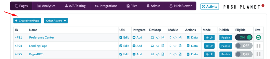
To design a page with our page builder, start by clicking the Create New Page button in the top-left:
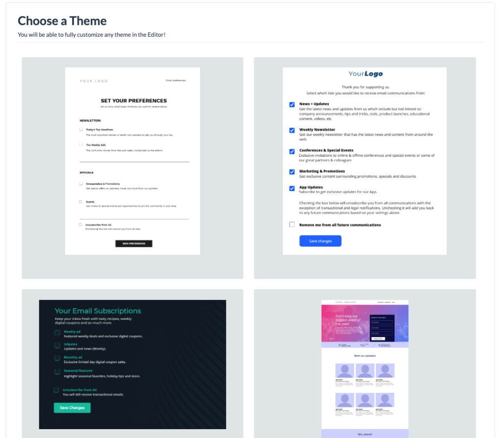
On the next page, you’ll be prompted to pick a theme. Whether you need a registration page, landing page, or preference center page, the editor provide plenty of great themes to use as a starting template for your design. To create your page from scratch, select the “clean slate” theme to start building with an empty page.
After you select your theme, you will have the opportunity to name your new page. Once you save your name, you will arrive in the page editor automatically.
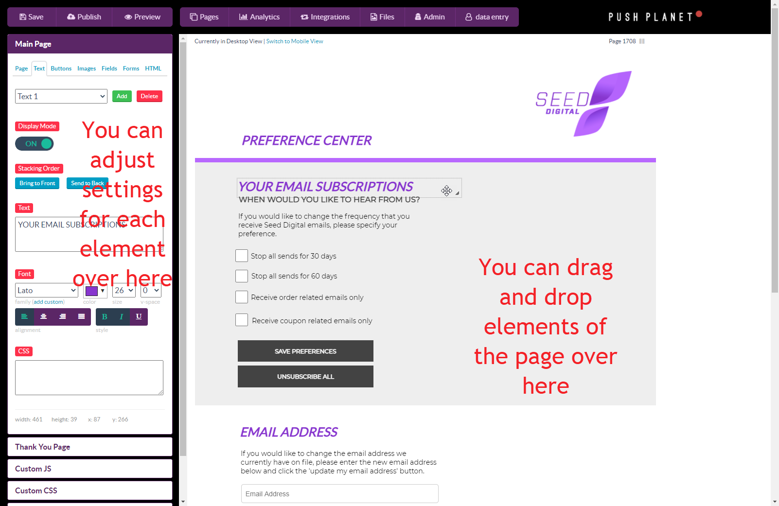
In the editor, drag and drop to move images, text, buttons, and other page elements around the canvas on the right. Use the left panel to add new elements to your page and edit the settings for existing elements. Just choose the correct tab (page, text, buttons, images, fields, forms, and HTML), then toggle elements on/off and make adjustments as needed. Clicking on a element in the cavas will open it’s styling tools on the left panel.
On the Page tab, you also have the ability to add custom header/footer HTML and CSS from the left panel as well.
Tip: we recommend keeping your desktop page width 1000px or less to ensure nothing will get cut off for small laptop screen users.
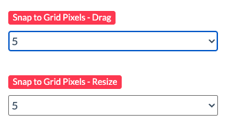
Tip: On the Main Page panel, set the Snap to Grid Pixels – Drag & Resize to 5px or 10px to help you easily move and align elements around the canvas.
Once you’re satisfied with the design of your page, follow these instructions to set up a form on the page.
Finally, when visitors submit the form on your page, you have a few options on what happens after submit. The most common actions are to Show a Success Banner or Show a Thank You Page.
- For Success Banner, simply add the Message Text you want to be displayed.
- For Thank You Pages, make sure you remember to design your Thank You page too!
The editor displays your page in Desktop View by default, but don’t forget to switch to Mobile View to set up a mobile version of your page!
To create a mobile version of the page you’re currently working on:
First, save your changes on desktop. Then, click the “Switch to mobile view” link at the top of the editor.
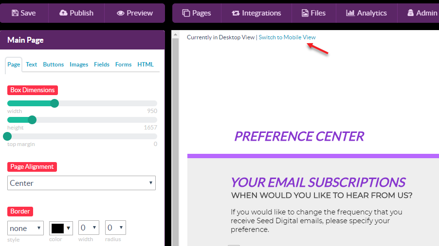
You will be taken to the mobile version of your page. Changes on desktop are not reflected on mobile. If you’ve only made a few changes to template, you’re welcome to make similar updates on mobile. Otherwise, it’s easier to follow the next steps to duplicate from desktop.
To copy your design from the desktop version to use as a starting point, click “Copy All Desktop Pages to Mobile” in the Main Page section of the editor.
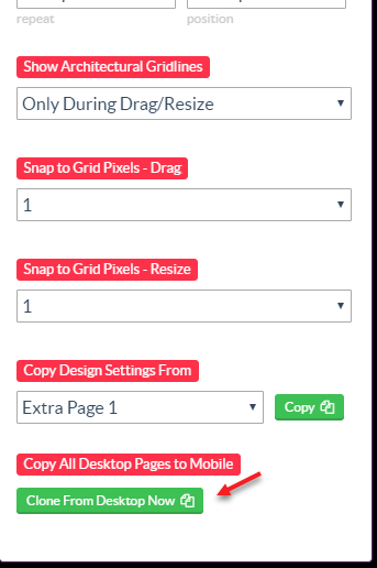
This will clone all elements and settings to the Mobile view. You’ll need to then rearrange and update your design to fit in a mobile-sized view. We recommend setting your mobile page width to 360px. This will ensure if looks good on slim phones such as Android’s.