This article will walk you through the basics of your quiz design. When you have the foundation built, please get in touch with your onboarding manager to have our design team take it the rest of the way for you.
VIDEO: watch the video below for an overview of Digioh’s Global Design Settings
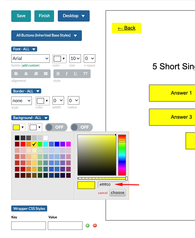
Font:
You can edit your font styling by using the options in the Font section. There are options to choose your font-family, size, letter-spacing (v-space), alignment and more.
If you would like to use a custom brand font, you will want to upload and make it available in your Digioh account prior to starting the Qwizard. You can find the help doc on how to do that here: https://help.digioh.com/knowledgebase/how-to-add-your-own-custom-font/
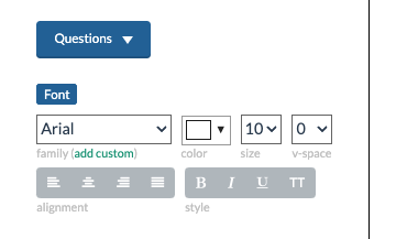
You can choose different font options for Questions, Subtext or any Button styles by switching to them from the Element dropdown.
Desktop vs Mobile:
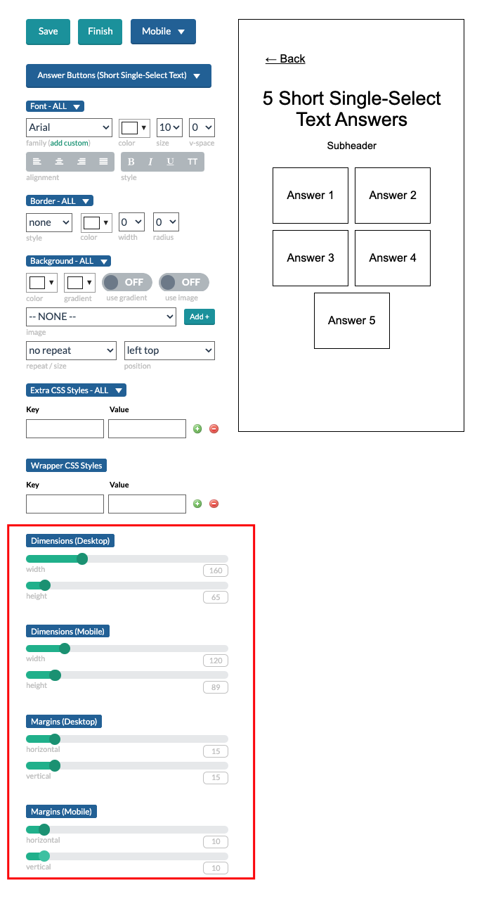
Changes to the design elements will do so across both desktop and mobile, with the exception of Answer Button sizing and margin. By default, the sizing of Answer Buttons will be set up to accommodate desktop and mobile, but if you would like to edit them, you can do so by selecting the specific type of Answer Button and using the Dimension and Marin settings towards the bottom.
The Global Design Settings allows you to preview how your design changes will look on desktop and mobile by choosing the view from the dropdown.
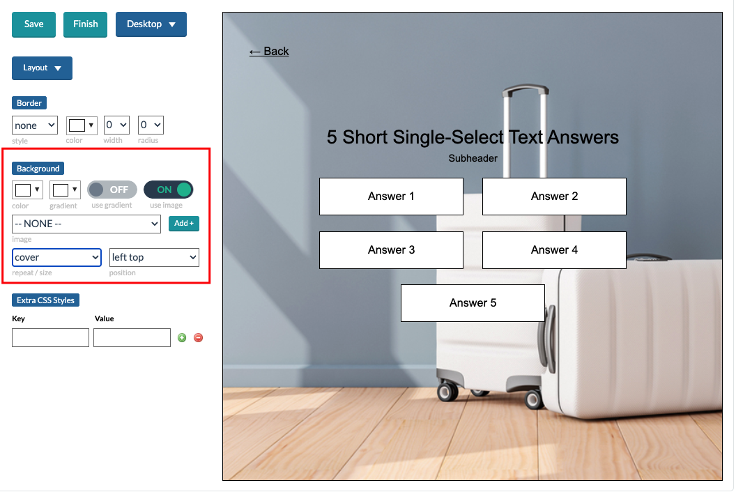
Background image:
To add a background, go to the Background section of the Layout. Toggle ON “use image” and select the image you would like to use from the dropdown. You can use the dropdown options under “repeat / size” and “position” to place it how you would like it.
A similar method can be used if you would like to use images on buttons.
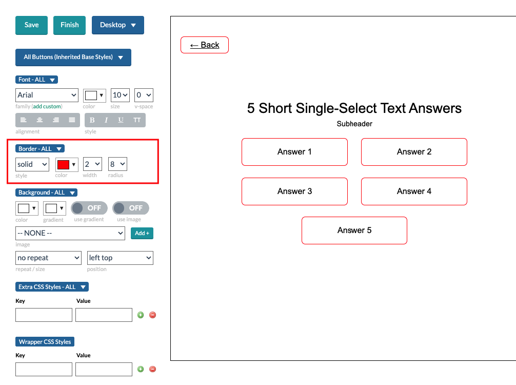
Borders:
You can set the border for buttons or the layout using the Border design options. Something as simple as border radius can really help a quiz look more branded.
Other important tips:
- Always hit SAVE in the design settings before Finish Quiz. If you don’t, your design changes will not be applied when the quiz is generated.
- If most of your buttons should look a similar way, start by editing All Buttons (inherited Base Styles) to set the changes you need, and then edit each specific Answer Button type after.
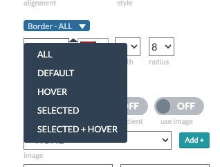
- You can change Hover, Selected and Selected+Hover states for buttons by clicking the section label dropdown for each design element.
- You can always edit the quiz further in the normal editor after you finish the quiz. If things aren’t looking perfect in the Qwizard preview, don’t sweat it!
Multi-Select Buttons
If your quiz contains questions that allow more than one answer, these are known as “Multi-select” questions. You will need “Select” buttons, as well as a “Next” Button.
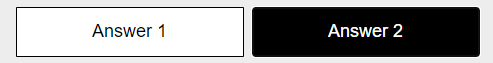
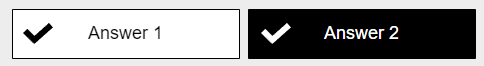
When customizing the design Multi-select buttons, it’s important that quiz takers can easily tell when a button is selected vs deselected. By default, the quiz will use checkmark images to indicate that an answer is selected.
We recommend differentiating the Selected and Selected + Hover states through design differences such as:
Example 1: A checkmark background image on Selected and Selected + Hover button states
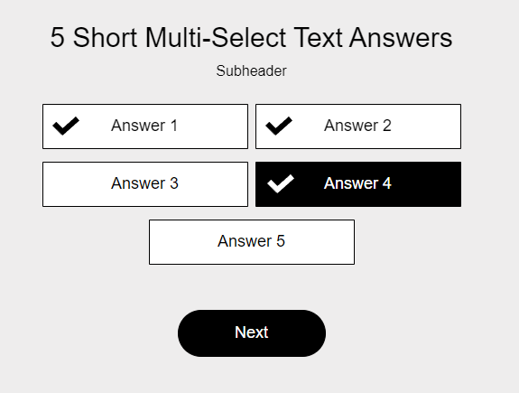
Example 2: A transparent background when a button is not selected vs a background fill when a button is selected.
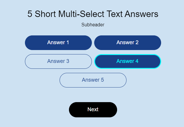
Note: Your mouseover state should be similar on both Hover and Selected + Hover states. For example, if you use a background color on Hover, you should also use that effect on Selected + Hover.
Default State vs Hover State
Selected State vs Selected + Hover State
For more tips about styling Select Buttons, read How to Make Multi-select Answers
Once you generate your quiz, you will be taken to the main “Boxes” page, this is where all your campaigns live (like your Quizzes, Pop Ups, Web Forms, and more). Click on the name of your quiz to enter the Box editor. This is where you can use our drag and drop builder to add additional questions, modify questions, and more.
When you click inside the editor, every item is Drag and Drop, you can move the buttons around and when you click on them you can modify the text, color, fonts, and more on the left panel. Please review our end to end design documentation where we cover even more design elements.
Once you design the quiz, you will also need to design the Mobile version by clicking on the “Mobile” button.
Your next step is work on your quiz logic and other settings. You can find that guide here!