
What You’ll Learn
In this guide, you’ll discover how to utilize Digioh’s responsive Screen Size features to design campaigns that look great on any device. Not only does this provide a better experience for your users, but it can also help you increase form conversions, particularly for mobile visitors.
With the responsive width screen sizes in the Digioh editor, you can:
- Control exactly what your campaign looks like at different screen sizes.
- Start from one design, then easily create a mobile version.
- Create up to 3 additional screen sizes if needed.
- Modify each version independently by dragging and dropping elements.
Note: Screen Sizes previously called “Breakpoints” are helpful if you want to show the same offer to users on all devices; however, if you want to display different campaigns to visitors on particular devices, you can use our display rules to target visitors with a certain campaign based on what type of device they use.
How to Use Responsive Screen Sizes in Digioh
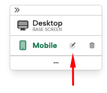
When creating a new campaign from a theme, many will already come with a Desktop and Mobile Screen Size by default. When you enter the editor for a campaign, you will land on the Desktop Screen Size. To enter the Mobile Screen Size, click the mobile icon in the top right corner of the Screen Size toolbar.
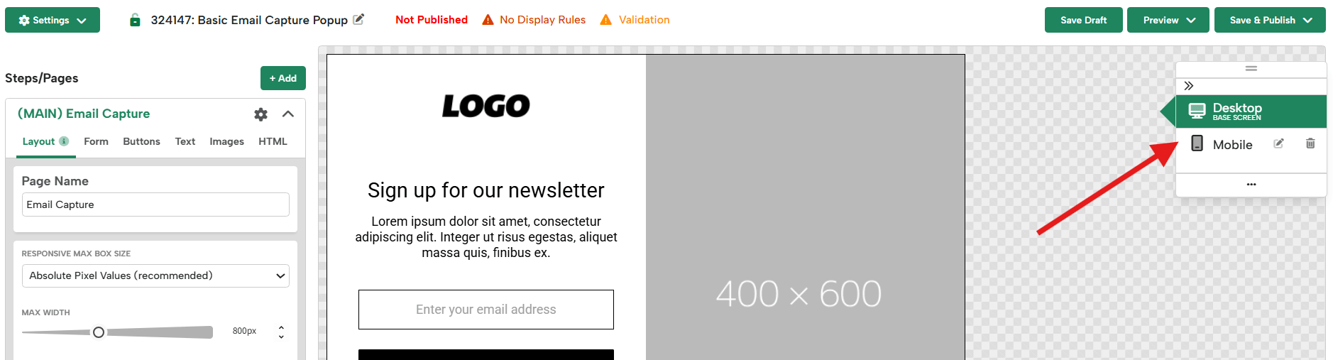
If the theme you’ve started from does not already have a Mobile Screen Size, or if you’ve deleted the Mobile Screen Size, the Screen Size toolbar will note that the campaign only has 1 Screen Size for All Devices.
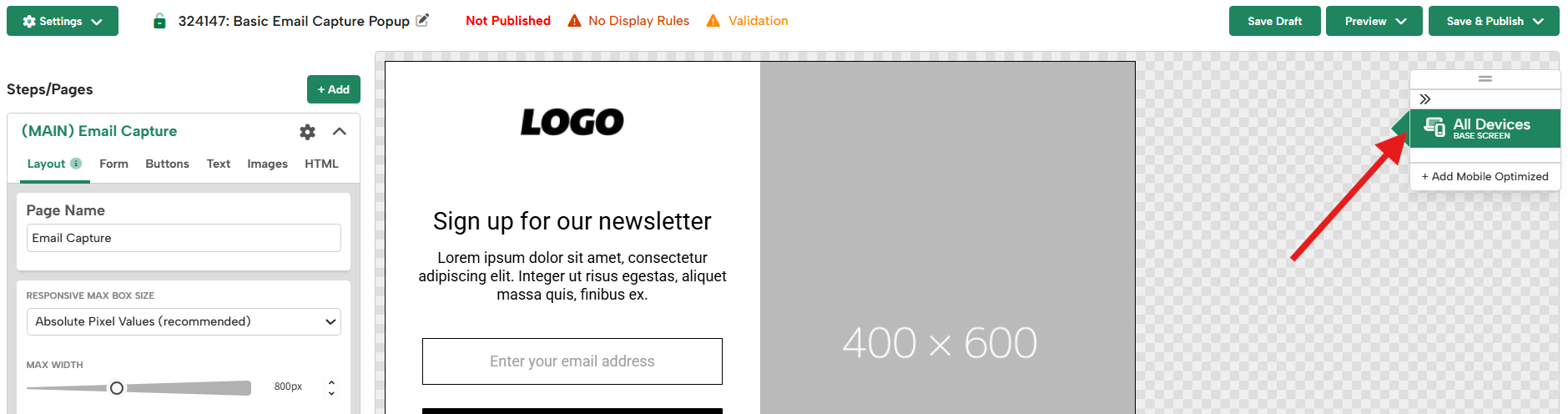
How to create a new mobile screen size
Tip: When starting from a theme, if you’ve made many design edits to the initial Desktop Screen Size, it may be faster to delete the previous Mobile Screen Size and recreate one from your new Desktop design. Creating a new Mobile Screen Size from your Desktop version will duplicate your design to mobile and allow you to resize and reorganize your design for a mobile view, instead of remaking your design completely on the mobile screen size from the theme.
To create a new mobile version of your campaign, follow these steps:
- To add Mobile Screen Size to a campaign, within the Editor, click the “+Add Mobile Optimized” button in the top-right corner toolbar:
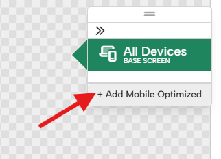
- This will create the Mobile Screen Size, which will have its Maximum Screen Width automatically set up to display if a user’s browser window is smaller than your Desktop Campaign design’s width dimensions.
Example: If your desktop design is 800px wide, your Mobile version will be set up to show for users whose screen is smaller than 800px.
Note: If your Desktop design is above or below a certain width, you may be prompted to add the Maximum Screen Width manually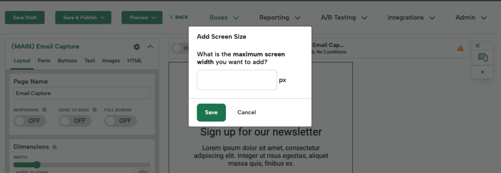
Maximum Screen Size Tips:
- For smaller-width pop-ups, Sidebars, Banners, or Inlines: 515px is a good default maximum width to show the mobile version.
- For larger width pop-ups and Sidebars: if you’re using our Responsive feature (available within campaign settings), you can set the maximum width to what works best for your design. If you’re not using Responsive, we recommend sticking with the Desktop Design’s width.
- For larger Inlines and Banners: Use the desktop design’s width to avoid your design being cut off on smaller screens.
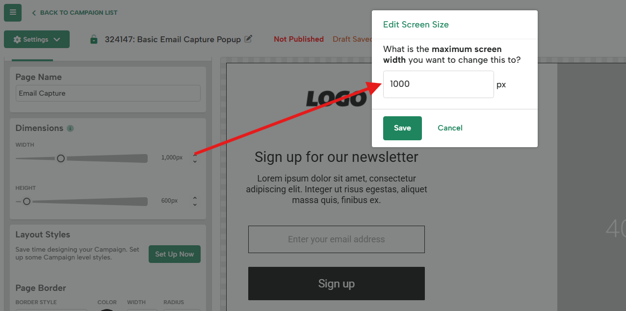
- You can always adjust your Maximum Screen Width using the edit button in the toolbar next to your Mobile Screen Size.
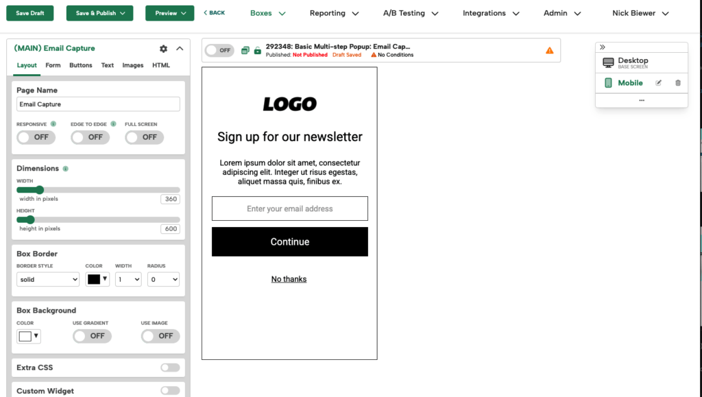
- Click into the Mobile Screen Size in the toolbar and customize the design by adjusting campaign dimensions and elements. This is what will appear when the user’s max window width is lower than your desktop design, so you want it to be smaller than that. For mobile designs, we recommend keeping your campaign width at 360px or less. For more information, see our Recommended Sizes for Desktop and Mobile help doc.
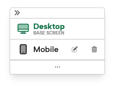
- You can return to your Desktop version at any time by clicking the “Desktop (Base Screen)” button:
Additional Screen Sizes:
While we recommend only using Desktop and Mobile Screen Sizes, you can create up to 3 additional Screen Size variations of your campaigns. This can be useful if you need to create an Inline campaign that has a very wide desktop design and will need additional sizes, such as Tablet before showing the Mobile design.
To create an additional Screen Size, tap the 3 dots below Mobile in the toolbar, and you will be prompted to input the Maximum Screen Width for that variation.
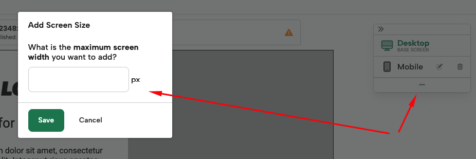
Note: the design for your additional screen size will be duplicated from the design you’re currently on, so if you’re in your Mobile Design, it will duplicate the campaign design from that version.
Follow similar steps to update your design to the size and layout you desire.
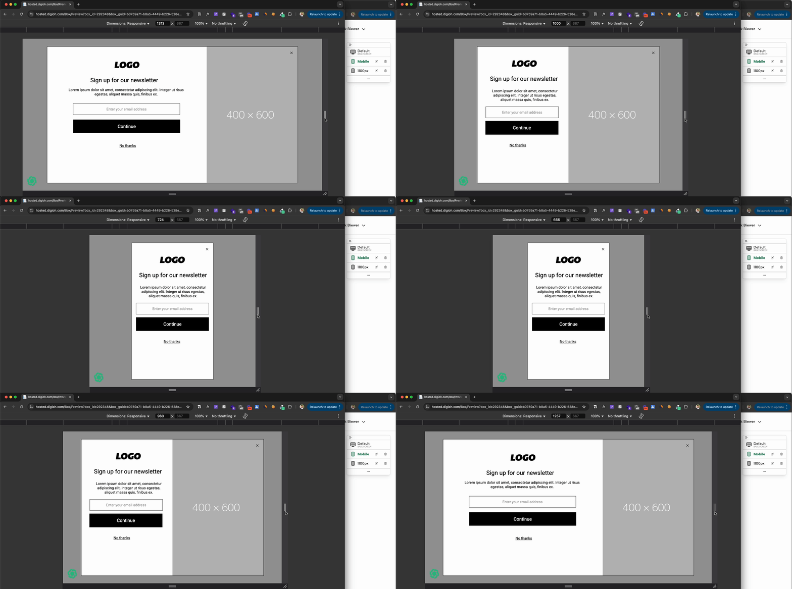
This Screen Size will show when a user’s window is below the px value set here, up until it reaches the Mobile Screen Size’s Maximum Width value.
Example: Your desktop design is 1100px wide, and your Mobile Maximum Width is set to 600px. You would want to set this additional Screen Size to 1100px. It will then be the Desktop version to users whose screen size is above 1100px wide, then your additional Screen Size between 1100px and 600px wide, and your Mobile Screen Size below 600px.
Related Reading: