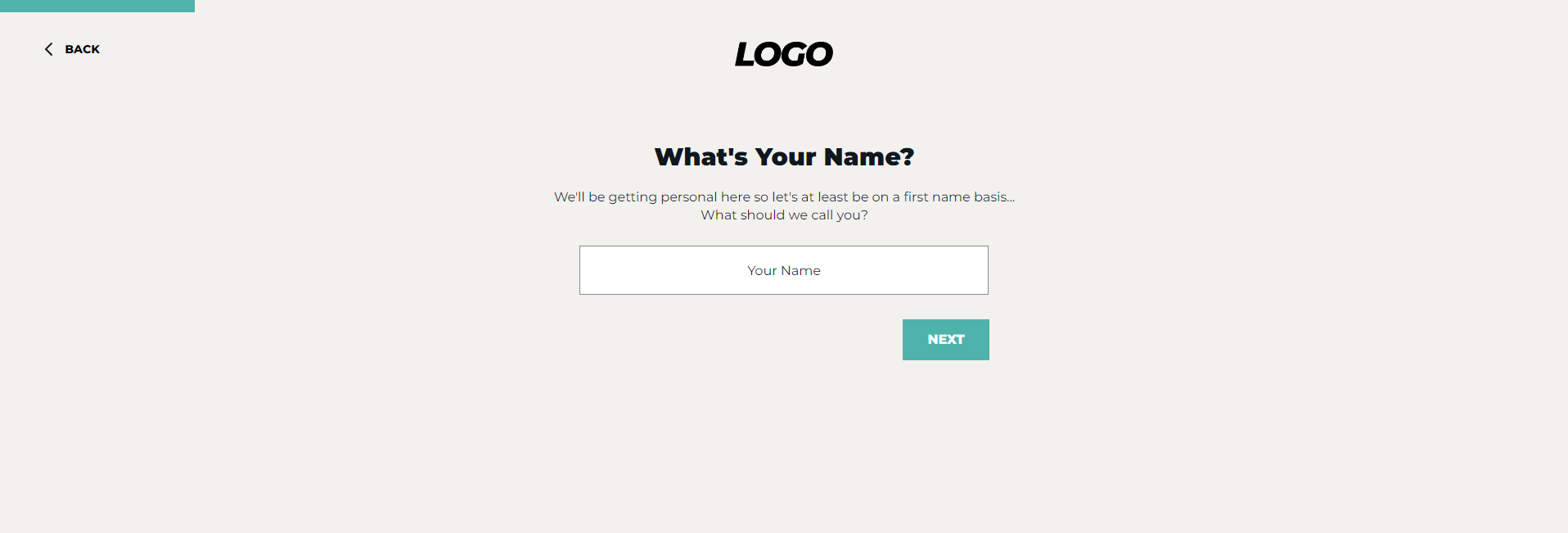
You can create a progress bar with some simple HTML and CSS. Some themes have HTML progress bars included, but they may need to be edited for your needs. You can change the color, size, shape and percentage of progress bars in a few short steps.
Understanding the Code

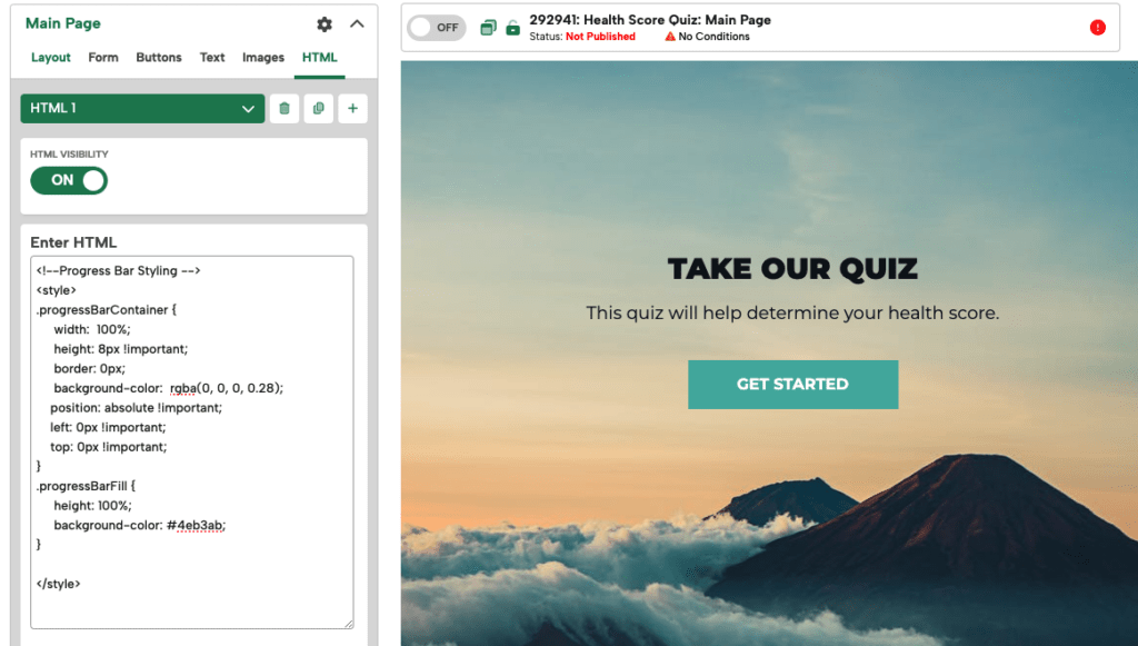
This is HTML that makes up the progress bar:
<!--Progress Bar Styling -->
<style>
.progressBarContainer {
width: 100%;
height: 8px !important;
border: 0px;
background-color: rgba(0, 0, 0, 0.28);
position: absolute !important;
left: 0px !important;
top: 0px !important;
}
.progressBarFill {
height: 100%;
background-color: #4eb3ab;
}
</style>
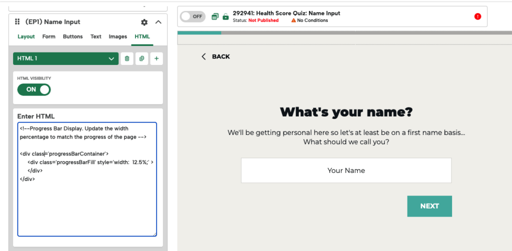
<!--Progress Bar Display. Update the width percentage to match the progress of the page -->
<div class='progressBarContainer'>
<div class='progressBarFill' style='width: 12.5%;' >
</div>
</div>There are 2 divs that make up a progress bar:
progressBarContainer
This div is the background of the progress bar and represnts 100% of the width.
progressBarFill
This is the fill bar which represents your progress so far.
You can put the CSS (everything inbetween style tags) on the Main page and that CSS will apply to every Extra Page as well.
Editing a Progress Bar
If you click on the progress bar in the editor, it will open the HTML block that contains it.
The first page of your quiz should contain the styles that control the look and feel of the progress bar across every page. That’s where you can edit the styles of the bar.
Note: Make sure you put the styles for the progress bar in the Main Page of your campaign so those styles load in subsequent pages. If this page is a splash page where a progress bar is not needed, you can normally still find or place the <style> code in HTML1, without including the divs that display the bar.
Customizing Container Styles
You can edit the background color, height, border, and border radius of the container.

We recommend a light opacity background, like rgba(255, 255, 255, 0.33).

Setting the border radius to 0 gives it square edges, as where higher numbers make it rounded. In this example, the Container and Fill are using a border-radius of 20px.
Customizing Fill Bar Styles
You can edit the background color and border radius of the fill color. You can even get fancy and add gradients.

.progressBarFill {
height: 100%;
background: rgb(58,177,205);
background: linear-gradient(198deg, rgba(58,177,205,1) 0%, rgba(44,192,175,1) 46%, rgba(153,200,240,1) 100%);
border-radius: 20px;
}
Editing Percentages
Percentages are calculated manually. So you have to enter the percentage you want to show on each page. In order to do that, you have to change the percentage shown on the div on each page.
If you have 4 questions, you might do something like this:

Page 1:
<div class="progressBarContainer">
<div class="progressBarFill" style="width: 25%;"></div>
</div>

Page 2:
<div class="progressBarContainer">
<div class="progressBarFill" style="width: 50%;"></div>
</div>

Page 3:
<div class="progressBarContainer">
<div class="progressBarFill" style="width: 75%;"></div>
</div>

Page 4:
<div class="progressBarContainer">
<div class="progressBarFill" style="width: 100%;"></div>
</div>
Full Width Progress Bars
If you’re using Edge to Edge settings, you may want your progress bar to be 100% width of your window.
By default, with Edge to Edge settings, the content in the editor will be centered, but the campaign background will stretch to full 100% of your view window. That means your progress bar will also be centered.
You can however use a Wrapper CSS trick to force the progress bar to stretch to the width of your window.
While in the HTML1 editor, toggle on Wrapper CSS and add this code into the CSS Property and Value(s):
left : 0
width : 100%
top : 0 (if you want your progress bar to stay at the top)
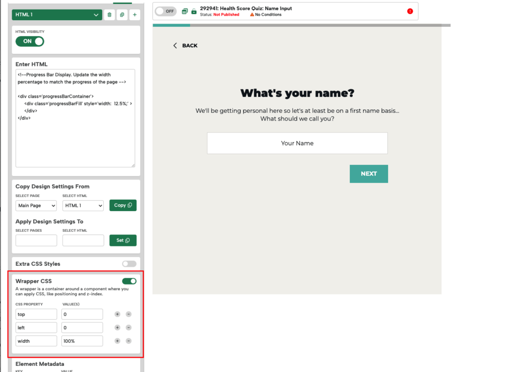
The positioning and width will override the base code and allow the HTML wrapper to be full width. You will have to edit the Wrapper CSS on each HTML block you’re using per page Extra Page you’re a progress bar on to be consistent.
Image Progress Bars
Another option for progress bars, is to use images. You can design them ahead of time and upload the images you want to use for each step.

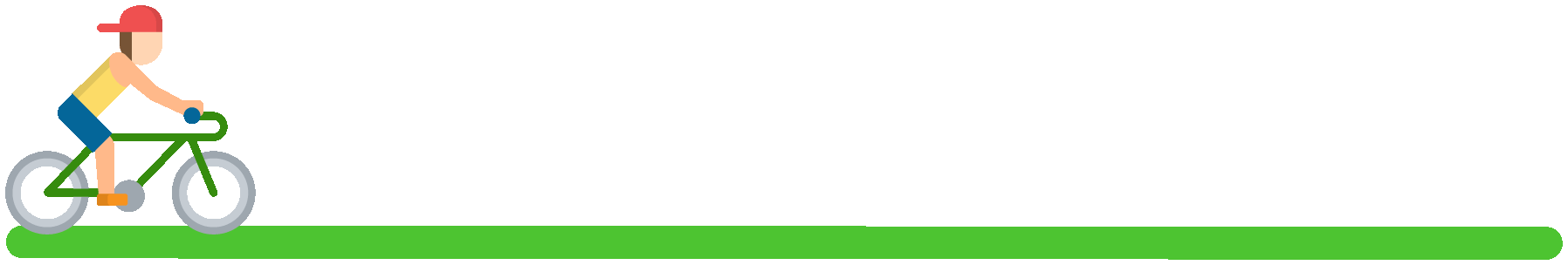
You could represent that with visuals like dots indicating what section you’re on, or even a character that moves across the screen as you progress.