What You’ll Learn in This Article:
- Add images to pop-ups, backgrounds, and buttons to create eye-catching designs.
- Use the right image size for different elements to maintain clarity and fast load times.
- Use CSS to adjust positioning, image sizing and padding for a refined look.
Including images in your Digioh campaigns can be a great way to brighten up your designs and reinforce your branding. Below are some basic steps to get you started using images within Digioh.
Accepted image File types:
Here are the image file types Digioh accepts:
- JPG
- PNG
- SVG
- GIF
- WEBP
Warning: Our platform has a 4mb file size limit, so if it is larger than that please reduce the file size prior to uploading. We also recommend images be no larger than 1mb for faster load times.
The 3 main areas you can use images are:
- Standard Image Elements
- Page Backgrounds
- Button Backgrounds
Uploading images:
There are 2 places you can upload images.
- In the editor
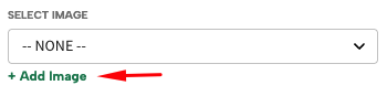
While working on a box within the editor, you can upload an image file directly to the box page or element by clicking the “+ Add Image” button on the page.
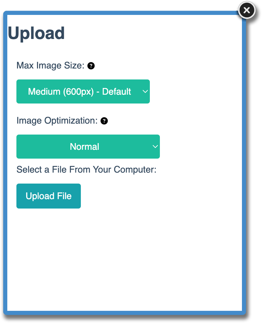
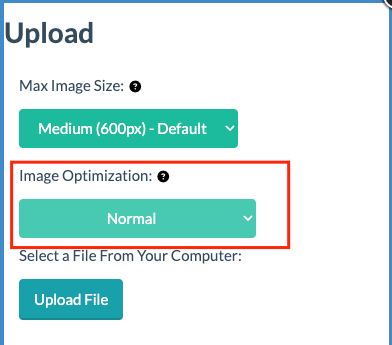
After clicking “+ Add Image” you will be prompted with Max Image Size and Image Optimization options. More information on these options below.
- In the Upload Files section
Navigate to the dropdown under your username and click “Upload Files”. Here you can access all of your files and upload images in this section of the platform. You can also upload multiple files at the same time in this section, as well as other file types like fonts. You can also replace images or delete them.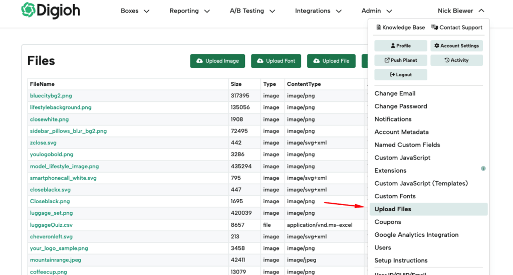
Image sizing:
It is always best practice to upload your images in the size and aspect ratio you intend to use it in. In addition to that, the platform has a few options for scaling down your image size.
When uploading, you will be prompted with options for resizing and optimizing your image. This allows for faster loading of boxes.
The pixel value for each option determines the width your image will be resized to. The height adjusts automatically to maintain the original aspect ratio. To prevent your image from being scaled down, select the size larger than your image’s current width or select Override to avoid any resizing. Info: These settings will not scale your image up.
Here are the recommended sizes for different uses of images in Digioh:
- Button Icons: Small
- Button Images: Small to Medium
- Image elements Medium to Large
- Background Images: Large to Extra Large.
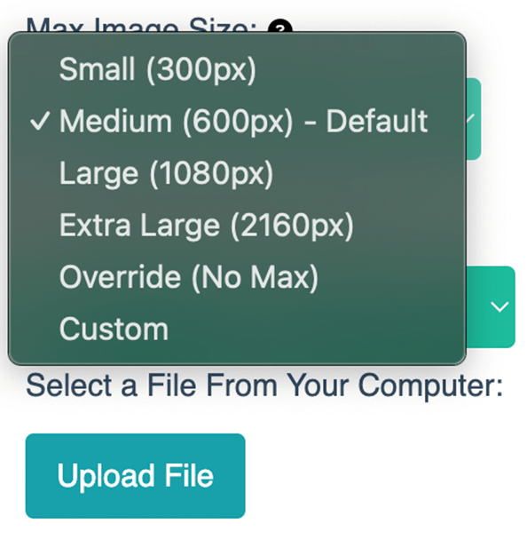
You can also select Override so that your image will stay the same size as your original file, or use Custom to scale down to specific sizing. It is recommended to only have 1 Extra Large or overridden image in a box to avoid longer load time.
Tip: If you’re still having a long load time after optimizing your images you can turn on preload images.
Warning: Since SVGs are scalable, the upload size settings will not affect SVG. You can use the element settings discussed below to size them as needed, or the SVG file can be edited in an editor like Illustrator or a coding program.
Once you have your image uploaded and added to an image element in the editor, you can use the drag and drop resizing of the element to change the sizing. If you’re using the image as a background for the page or a button, you can use the Image Position options to place in the location you need. Using the Cover or Contain options in the Image Repeat / Size can also help resize your image to fit the button or page. See the Button and Box Image Background sections for more details
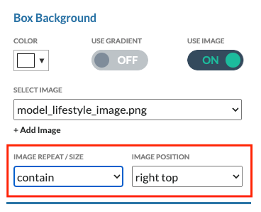
Image Optimization:
We recommend keeping this set to “Normal”. This will optimize the file size of your image to help with load speed of images in your boxes. This should not have any effect on image quality, but in the event that it does, you can reupload the file with “Override” selected to bypass the optimization.
To learn more about specific use cases for images, view details on each below.
Image Elements:
You can edit an image element by clicking on the element within the editor or selecting it from the Image tab element dropdown.
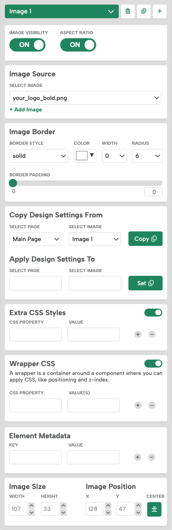
Image Visibility: turn the image element On and Off.
Aspect Ratio. Turning Aspect Ratio off allows the image to stretch outside of its original aspect ratio. When Aspect Ratio is turned on it will determine the height of the image based on the width. It is recommended to keep this toggled on for best image quality.
Image Source: Change the image file in the dropdown or add an image using the “+Add Image” button.
Image Border: Add and edit the border of an image, including border style, border radius, and border padding.
Extra CSS Styles: Add CSS code to the image, for example the opacity of the image (opacity : .5).
Wrapper CSS Styles: Add CSS code to the wrapper of the image, for example forcing the image to always be touching the left side of your box (left : 0).
Image Size: You can use the drag and drop resizing Change the width and height of the image, or input specific pixel values.
Image Position: You can click and drag the image to where you want it in your design, or you can also input specific pixel values for the X and Y locations on the page
Button Background Image :
The image is placed within the button as a background image. You can add your image by toggling on “Use Image” in the Button Background section and using the Select Image Dropdown or “+Add Image” button.
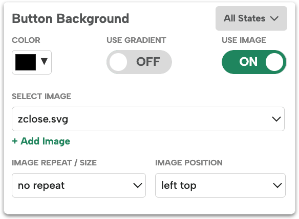
Buttons have multiple states: default; hover; select; select + hover. You can edit the image independently in each state.
- All States: How the button will look in all states. You can use this to set the Default button styling, then update the other states as needed.
- Default: How the button looks without a cursor interacting with it.
- Hover: How the button looks when a cursor hovers over it.
- Select: How the button looks when being clicked.
- Select + Hover: Only used on Select Buttons. How the button looks when it has been selected and the cursor is hovering over the selected button.
Image Repeat / Size
The image repeat option allows you to set your image to repeat inside the button. You can pick between: 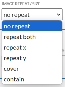
- No repeat: This is the default and will show your image at the size it was uploaded
- Repeating horizontally (x)
- Repeating vertically (y)
- Repeating both.
You also have the option to size your image in this dropdown.
- Cover: This makes the image scale to cover the entire button. Some parts of the image might be cropped.
- Contain: This will scale the image, but ensures the entire image is always visible inside the button. If your image wasn’t uploaded at the exact size needed for the button, we recommend this setting
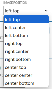
Image Position
Image position allows you to decide where the image will be within the button. If your Image Size is set to Cover, this will set the image’s focal point if it gets cropped.
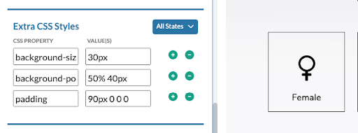
Extra CSS Styles
If you need to be very specific with image size or positioning, you can add extra CSS to the button to adjust this.
Example:
Background-size: 30px
Background-position: 50% 40px
If your button will need to include text along with the image and don’t want the text centered within the button as it is by default, you can use CSS padding to move the text position.
To have text below your image, set the image to Contain and positioned Center Top. In Extra CSS Styles you will add:
Padding: 90px 0 0 0
You can change ‘90px’ to the pixel value that works best for the positioning of the text in relation to your image and button size
Info: The CSS numbers function like a clock, starting at the top. So in the above example – top padding is 100px, followed by right padding, bottom padding, and then left padding, which are all set to 0. Similar rules for Background-position CSS as well.
Box Background:
The image will be placed in the background of your box page. It is recommended to upload Box background images at the size you intend to use them for the quickest setup.
- Example: Your popup is 800px X 600px and you want your image to take up half of the box, upload your image at 400px X 600px.
Image Repeat / Size
The image repeat option allows you to set your image to repeat inside the Box. You can pick between:
- No repeat: This is the default and will show your image at the size it was uploaded
- Repeating horizontally (x)
- Repeating vertically (y)
- Repeating both.
You also have the option to size your image in this dropdown.
- Cover: This makes the image scale to cover the entire Box. Some parts of the image might be cropped.
- Contain: This will scale the image, but ensures the entire image is always visible inside the box.
Image Position
Image position allows you to decide where the image will be within the box . If your Image Size is set to Cover, this will set the image’s focal point if it gets cropped.

Extra CSS Styles
If you need to be very specific with image size or positioning, you can add extra CSS to the button to adjust this. See the Button Background guide for examples.
Finding the size of an image of a box or theme
When starting from a theme, you will probably want to switch out the images for your brand. Uploading an image at the same size as the theme uses will make updating your design seamless. If the size isn’t obvious by looking, you can follow these instructions to inspect the elements and find their sizing.
With the box open in your browser (in preview or on your site) right click on the image and click “Inspect”
- For image elements you will see an <img> html tag in the inspector. Hover over the the blue highlighted image url and you will see the Rendered Size, Intrinsic size, and aspect ratios:
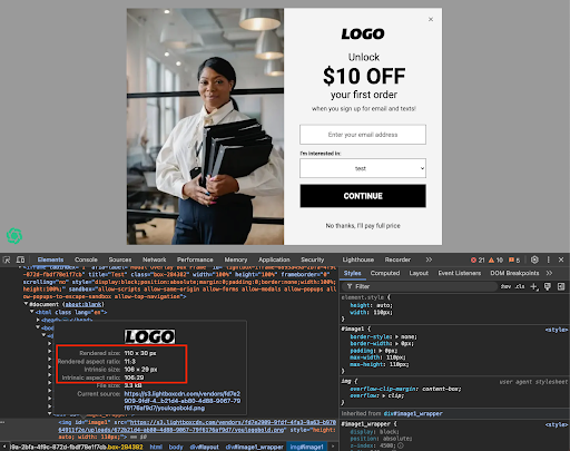
- For page or button background you will be taken to the Layout or <Button> element. To find the image link, look for the Background-Image CSS in the Styles or Computed tabs. There you will see the blue image link and can hover over it to see the rendered size and aspect Ratio:
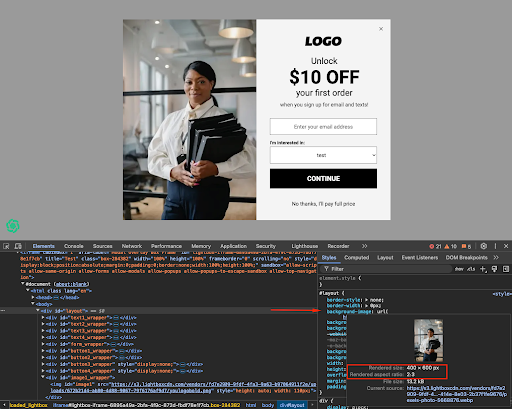
Intrinsic size refers to the original size of an image or element when uploaded to our platform, while rendered size refers to the size of the image or element as it appears on a page after CSS changes have been applied. Uploading your new image at either of these sizes should work in combination with the Contain and Cover features as needed. For background images you may only see Rendered size, so you can follow that.
If you have any questions or run into any issues, please reach out to support@digioh.com!