On mobile devices—especially iOS browsers like Safari—input fields can trigger an automatic zoom when a user taps into them. This behavior is controlled by the browser and commonly occurs when form text is smaller than the browser’s minimum readable size. In some Digioh campaigns, this auto-zoom effect can create an inconsistent or undesirable user experience.
This article explains why auto-zoom happens on mobile and how to disable it using CSS when appropriate.
How to Disable Auto-Zoom on Mobile
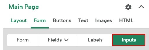
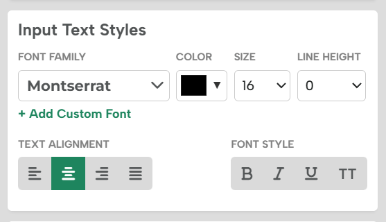
Mobile browsers automatically zoom input fields when the font size is below 16px. To prevent this behavior, you can explicitly set the input font size of form fields to 16px or larger in the campaign editor under Form > Inputs.

In the Input Text Styles you can edit the font size

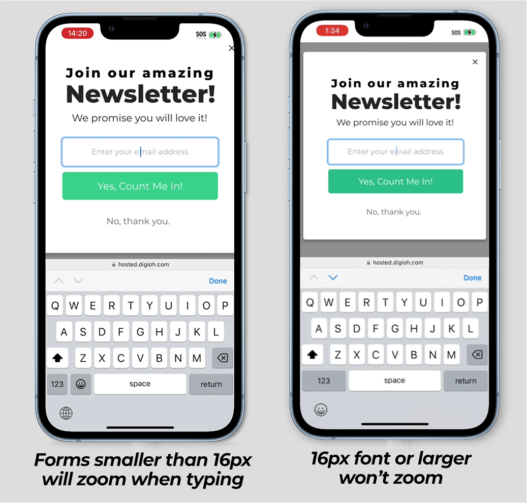
Below are examples of a form in Safari on iOS:
The one of the left shows a form with 14px text, vs the right is 16px text. As you can see, the screen zooms in automatically when you tap on the form on the left, but doesn’t zoom on the right.

