What You’ll Learn
In this guide, you’ll discover how to create interactive multi-select buttons in Digioh, enabling users to choose multiple options in your forms and quizzes. By following these steps, you’ll be able to:
-
Set up multi-select buttons that allow users to select multiple answers.
-
Apply distinct styles to buttons to indicate different states like default, hover, and selected.
-
Enhance user experience by clearly showing which options have been selected.
Buttons let you make things happen with your forms and quizzes. You can even make multiple selections at once with the Select Click Action.
How to set up Multi-Select Buttons:
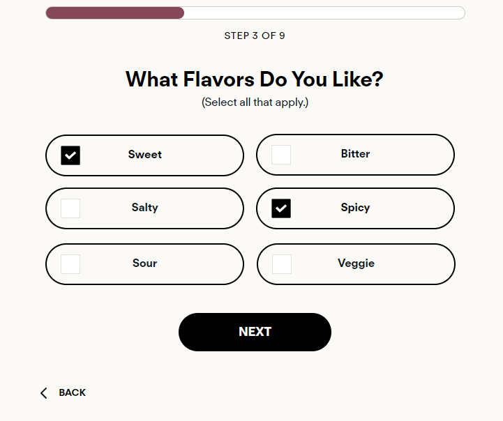
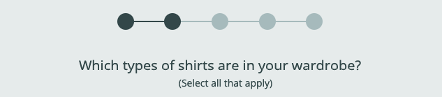
1. Make sure your instructions indicate to the user that you can select more than one choice (ie “Select all that apply”).
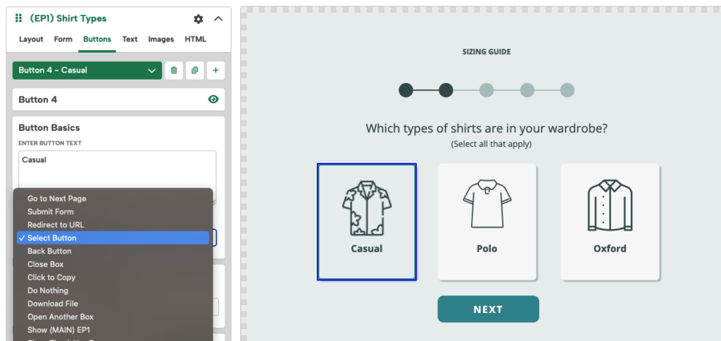
2. Create buttons for all of your possible choices.
3. Set the click action to “Select Button”
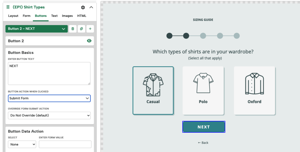
4. Create a Next button set to “Submit Form”
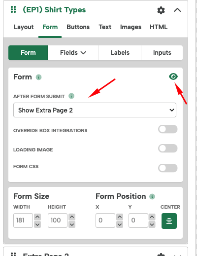
5. You will need to make sure the Form is turned on. Hide all of the form’s Fields if they’re not needed so they don’t display . Then you can configure “After Form Submit” action to direct what your page does next after submission.
Styling Select Buttons
There are 4 states for Select Buttons:
- Default – This is the default state of the button when not selected or hovered.
- Hover – This is how the button looks on mouseover, but it’s not selected yet.
- Selected – This is the state of the button when the user has clicked on it and it is selected as an option.
- Selected + Hover – This is how the button looks when it’s selected and hovering over it with your mouse.
You can edit the Font, Border, Background and others styles for every state. The “Default” tab will be open initially when clicking into a button, and you can click through the tabs to change other states.
Note: if you want edits you make on the “Default” state to translate to other states, make sure to toggle on “Copy changes to all states”

It’s very important that you design your buttons in a way that clearly indicates to the user when they have selected and unselected options.
Select Button Examples
Here are some suggestions on how to style buttons:
Text Select Buttons
Default: This should look pretty similar to any single select buttons you have.

Hover: This should also look similar to the hover state of any single select buttons you have. We recommend indicating mouseover on desktop with a subtle change, like a slightly darker background color.

Selected: To indicate a button is selected it has to look clearly different from the default button. One of the most reliable ways to indicate that a button is selected to inverse the colors from default state.

Some other good options are to outline the button or add a background image of a checkmark.

Note: You may need to add some Extra CSS, such as a background-size and background position.
In this case, we have:
background-size: 25px;
background-position: 10px 50%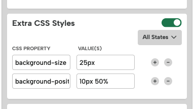
Selected + Hover: Make sure that the Selected + Hover state has the same indicator as the Selected state so the user doesn’t have to guess if they have already selected that button when their mouse is over it. In this case, we have the same colors the selected state, but have underlined the text.
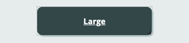
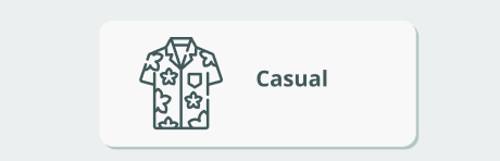
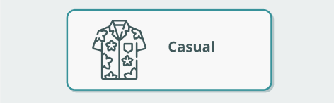
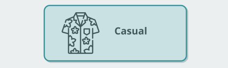
Image Select Buttons
Since image buttons already have a background image, it’s not as easy to add a checkmark. However you can usually make a selected button different enough by changing the outline color or fill color to indicate it has been selected.
Being consistent with your design will help convey the states to the user. It’s vital that you can tell the button is selected for both the “Selected” and “Selected + Hover” states.
Default: The default style of the button before its selected or hovered.
Hover: The background color has been made darker to indicate mouseover.

Selected: The background color matches the default style, but now a 2px outline has been added.
Selected + Hover: The background color matches the hover style, and the 2px outline from the selected state is also present.
To learn more about images in buttons, view our Images in Digioh help doc.
Advanced:
If you’re really skilled with CSS you can add 2 background images and positions and include an image and a checkmark. You would need to add CSS for each state with something like:
background: url('icon.png') 50% 50% no-repeat, url('checkmark.png') no-repeat, white;
It’s up to you to decide how you want to style select buttons, but just keep these tips in mind and make sure it’s easy to tell when a button is selected vs unselected.