What you’ll learn:
-
What “above the fold” means and why it matters for engagement
-
Best practices for keeping key content visible across different campaign types
-
Recommended sizes and tips for optimizing design on both desktop and mobile
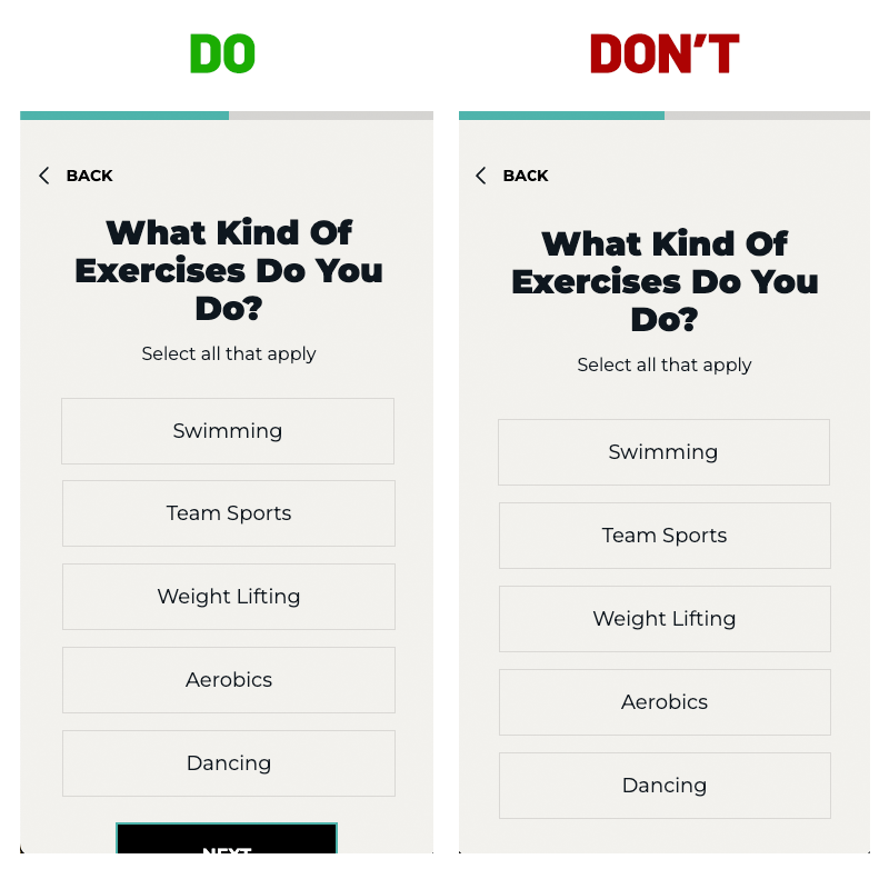
Designing your campaigns with key content “above the fold” ensures users see the most important parts of your message without needing to scroll. This increases the chance of immediate engagement and better user experience.
What Does “Above the Fold” Mean?
“Above the fold” refers to the portion of a webpage or campaign that is visible without scrolling. Placing important elements—like headlines, CTAs, or interactive features—in this area can:
-
Improve engagement
-
Enhance accessibility
-
Reduce user drop-off
A Quick Note on Scrolling:
It’s not always possible to fit everything above the fold, especially with longer content or on smaller screens. That’s okay! Users are used to scrolling. Instead of shrinking content to fit, focus on making it clear that there’s more below—like partially showing a button at the bottom of the screen to signal that the user should scroll.
Example:
Best Practices by Campaign Type
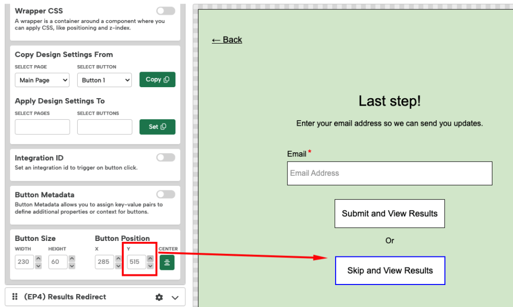
Embedded Inlines (e.g., Quizzes)
For quizzes or other embedded experiences, keeping key interactive elements above the fold can be crucial—especially on mobile where space is limited.
Keeping content above the recommended Y-coordinates below helps minimize friction and improve conversion rates.
Recommended Max Y-coordinates:
-
Desktop: 640px
-
Mobile: 530px
Tips:
-
Prioritize Key Content – Place the question and answer buttons within the visible area to minimize scrolling.
-
Optimize for Mobile – Make sure buttons are easy to tap and text is legible on small screens.
-
Minimize Distractions – Avoid large images or unnecessary text that push important content down.
-
Test Across Devices – Preview your inlineon various screen sizes to ensure a smooth experience.
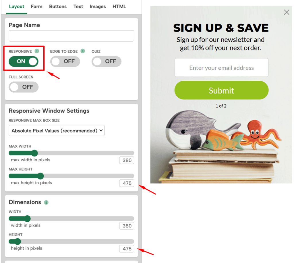
Popups (Lightboxes, Sidebars)
Since popups overlay a webpage, keeping content above the fold is less critical—but sizing still matters for a good user experience. We recommend always enabling Responsive Mode to ensure your popup adapts to different screen sizes.
Keeping your popup’s height dimensions under the the pixel sizes below will ensure they fit on almost any device.
Recommended Max Heights:
-
Desktop: 760px
-
Mobile: 660px
Tips:
-
Keep It Concise – Avoid overwhelming users with too much text or imagery.
-
Enable Responsiveness – Let your popup adjust automatically for different screens.
-
Make Closing Easy – Include a clear “X” or close button to avoid user frustration.
-
Test Across Devices – Always check how your popup looks on various devices.
Check out our Recommended Sizes help doc for more info and best practices.
By keeping content above the fold and following these simple guidelines, you’ll create more effective, user-friendly campaigns across all devices.