What you’ll learn:
- How to access and manage Box Styles
- How to create and customize text and button style presets
- How to use on new or refreshed features
- How to apply, duplicate, and manage styles across screen sizes
What are Box Styles?
Box Styles are reusable design presets that make it easier to keep your branding consistent across your Digioh box. You can create styles for text and buttons, then apply them anywhere in your box with just a few clicks.
Accessing Box Styles
There are two ways to access Box Styles:
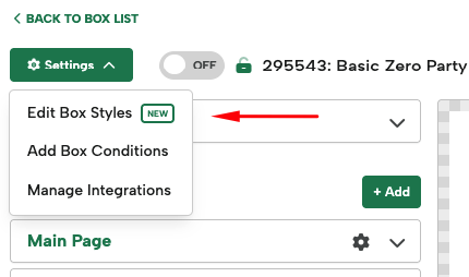
- Hover over the Settings dropdown in the top-left and select Edit Box Styles.
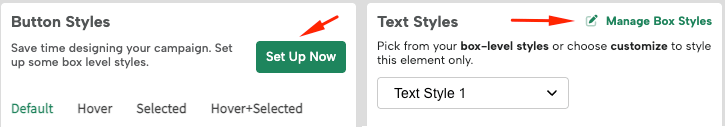
- Select a Text or Button to view the Styles section in the editor panel.
- If no styles are set up yet, you’ll see a Set Up Now button.
- If styles already exist, you’ll see Manage Box Styles.
- If no styles are set up yet, you’ll see a Set Up Now button.
Creating and Editing Styles
When you open the Manage Box Styles modal, you’ll see options for:
- Typography
- Buttons & Links
Click +Add Style to create a new style. Use the pencil icon to rename it to something clear and brand-relevant.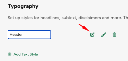
With your style created and named, now it’s time to customize them! Edits made in Box Styles will auto-save. However, make sure to still save your whole box when complete.
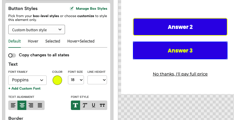
Typography Settings
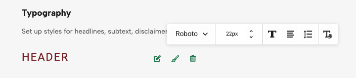
Click the paintbrush icon to access the toolbar where you can adjust:
- Font Family
- Size
- Style (Bold, Italic, Underline, Uppercase)
- Alignment
- Line-height and Letter Spacing
- Color and Opacity
Button & Link Styles
You’ll see the same text options as Typography, plus:
- Border (style, thickness, and radius)
- Background (solid, gradient, or image)
- Spacing (padding)
With Button Styles, you can also edit each different button state: Default, Hover, and Selected. We recommend starting with the Default state, as the styling there will extend to the others, then customize those as needed.
Feature Details
Let’s dive deeper into some of these settings as they have a new look or additional features.
Color Picker
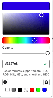
You’ll see a revamped color modal in the editor with the same capabilities as before. You can enter your color code (HEX, RGB, HSL, HSV, and shorthand HEX) or select from the color picker.
You can also use the pre-saved swatches at the bottom or add a new color swatch with your personal brand colors to reuse. When you’ve entered or selected your color, click the “+” button to save it as a swatch.
Letter Spacing
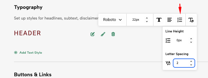
With this new feature, you can quickly adjust letter spacing in the toolbar for both text and button styles—just add your desired letter spacing pixel value.
Note: Letter-spacing does not work if using a Custom Button or Text element (yet!). You can use Extra CSS to achieve this on custom elements. Check out our CSS help doc here.
Button Border
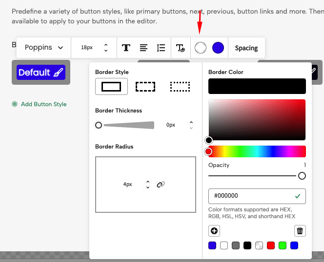
Border controls have also gotten a new look.
- Choose between solid, dashed, or dotted borders
- Choose your border color
- Use sliders or px input for thickness and radius
By default all corners will be linked on border radius. Click the link icon to unlink corners and customize each radius independently.
Note: Unlinked border radius’ do not work if using a Custom Button (yet!). You can use Extra CSS to achieve this on custom buttons. Check out our CSS help doc here.
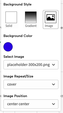
Button Backgrounds
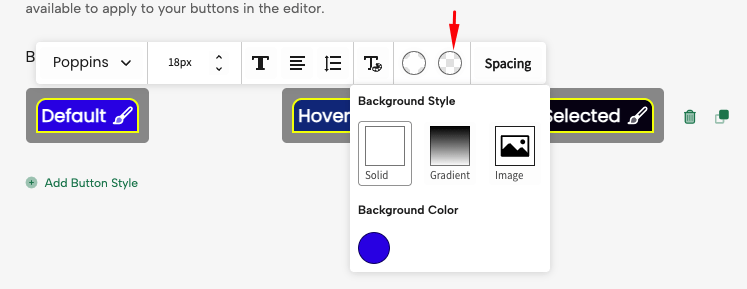
Button background controls have also gotten a revamped look.
Choose from:
- Solid color
- Gradient (select two colors for a vertical blend)
- Image
(To use a background image in Box Styles, you’ll need upload it to the platform first. It will then appear in the dropdown selector.)
With images you can select the background color, image, repeat/size and position. To learn more about images in buttons, see our full Image help doc.
Spacing
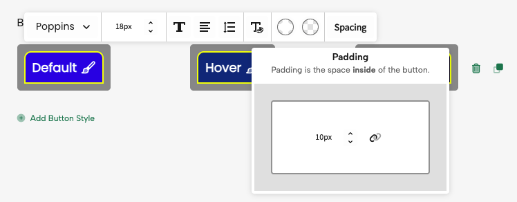
With Spacing you can fully customize the Padding of your buttons. Unlink the spacing to change the padding on specific sides to if needed.
Note: Unlinked Spacing does not work if using a Custom Button (yet!). You can use Extra CSS to achieve this on custom buttons.
Duplicating or Deleting Styles

- For Button Styles, you can use the duplicate icon to create a variation (e.g., mobile-specific style).
- Use the trash can icon to delete a style. You can only delete a style if it’s not actively used in a box element.
Applying Your Styles
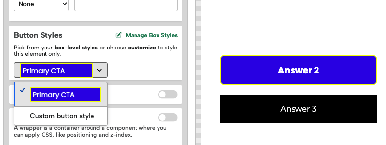
Once created, simply apply styles via the dropdown that appears in the design panel when you click a text or button element.
When applied, you’ll no longer see the normal design controls for that element, but you can always switch back to Custom Button/Text Style to create one-off elements. You can either work from scratch if no style was applied, or select a base Box Style and then switch to Custom to tweak it.
If you have any questions about Box Styles, please reach out to support@digioh.com!