The date picker field type allows you to:
- Collect birthdays or anniversaries.
- Perform age verification by rejecting submissions from individuals who don’t meet age requirements (for example: over 13, or under 65).
- Capture other dates relevant to your business.
How to Set up the Date Picker
Step 1: Before adding the date picker field, increase the form height to make room for an additional field. Go to the “Layout” tab and under “Dimensions” move the “height” slider to the right. You can fine-tune this setting after you see how your field fits in the form.
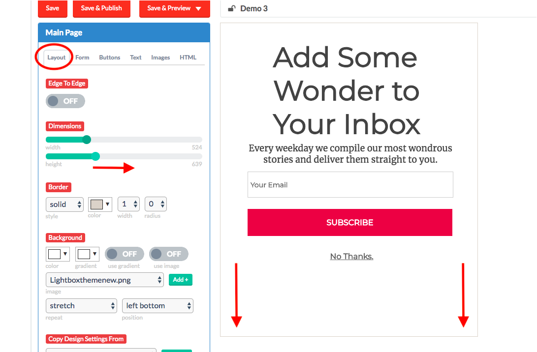
Step 2: Move buttons/text to make room for the date picker.

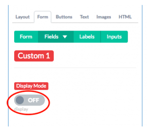
Step 3: Now you’re ready to add the date picker field. Go to the “Form” tab and select a “Custom” field.

Step 4: Click on “Display Mode” to toggle from OFF to ON.
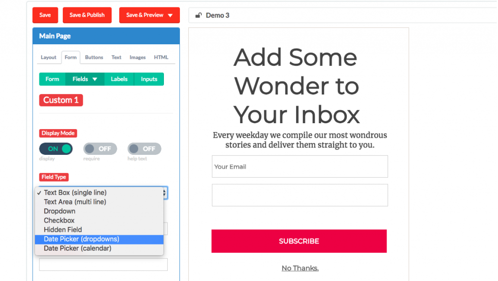
Step 5: For Field Type, select “Date Picker (dropdown)”.
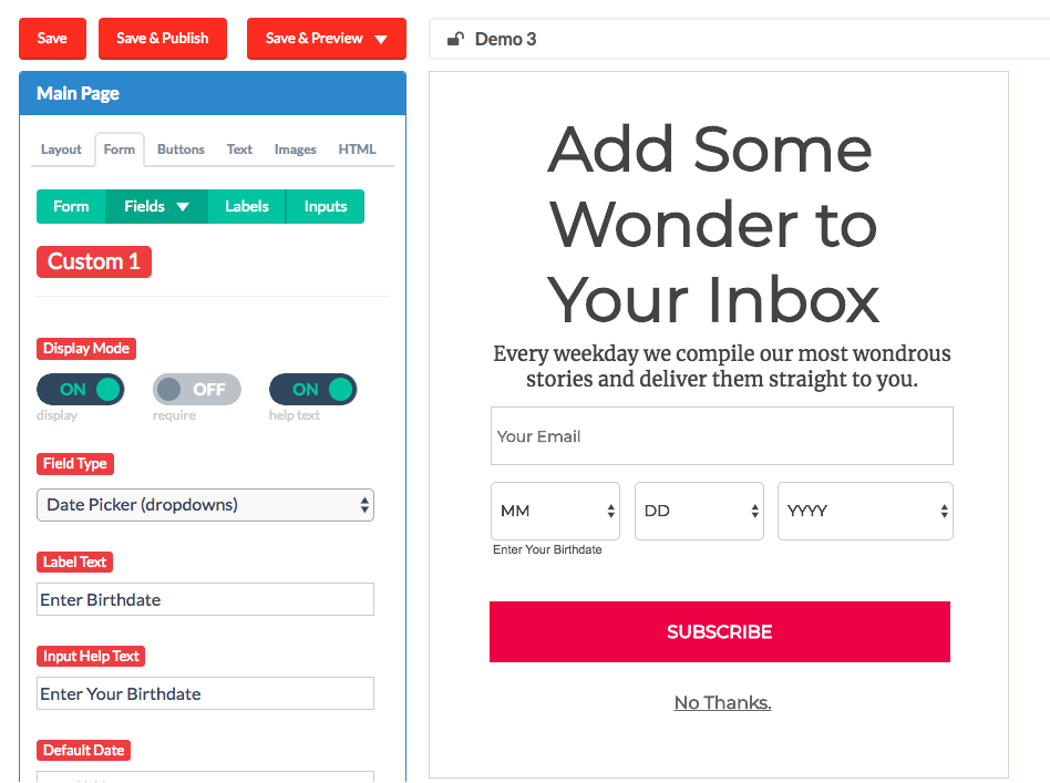
Step 6: Customize your date picker with the following settings:
- Label text: Your internal label for the custom field (e.g. “Enter birthdate”). This won’t be visible on the form.
- Input help text: The text users will see below the date picker. For example, “Enter Your Birthdate.” (Note: for this to be visible, “help text” in the “Display Mode” section must be toggled to “ON”.)
- Default date: The default text that users will see before they enter their information. The default setting is MM/DD/YYYY. You can change it to a specific date (eg 01/01/2018) if you prefer.
- Min. Selectable Date: The earliest date a user can enter (for example, you may not want to allow any dates prior to January 1st, 1900.)
- Max. Selectable Date: The latest date that a user can enter (for example, you may not want to allow any dates further than 100 years into the future).
- Min. Age: Use this for minimum age verification. The user’s age will be dynamically calculated based on their birthdate and the current date. Any submissions under the minimum age will be rejected.
- Max. Age: Use this for maximum age verification. Similar to the min age setting, this setting will reject submissions above your maximum age threshold.
- Display Format: Use this to display the date according to your country’s conventions. The default setting is MM/DD/YYYY.
- Output Format: To submit data to an integration that requires a different date format, use this setting to choose the correct output.
- Custom output formats (advanced): Use this if your backend integration requires timestamps or any kind of formulaic value.
Your date picker should look like this when you’re done:
Need help? Please send us an email!