There are a couple steps you’ll need to take to create responsive background sections in Push Planet:
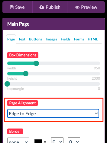
First, you’ll need to turn on Edge to Edge in the Page Alignment dropdown on the Page tab in the editor. This will give the ability to stretch the layout of your page to the size of the user’s browser window, while keeping the rest of the elements centered.
Note: you will still need to create mobile version of the page, as this feature will not make the page respond to sizes smaller than the Campaign Dimensions set in the editor.
Creating a Background Color Block
To a color block background section you will need to create an HTML element, and style it with some simple CSS code to make it responsive.
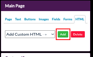
Step 1: Add a new HTML element from the HTML tab in the editor.
Step 2: Place this code into the HTML section of that element:
<style>
#html1_wrapper {
width: 100% !important;
left: 0 !important;
}
</style>

<div style='height: 140px; width:100% !important; background: #ff0000;'></div>
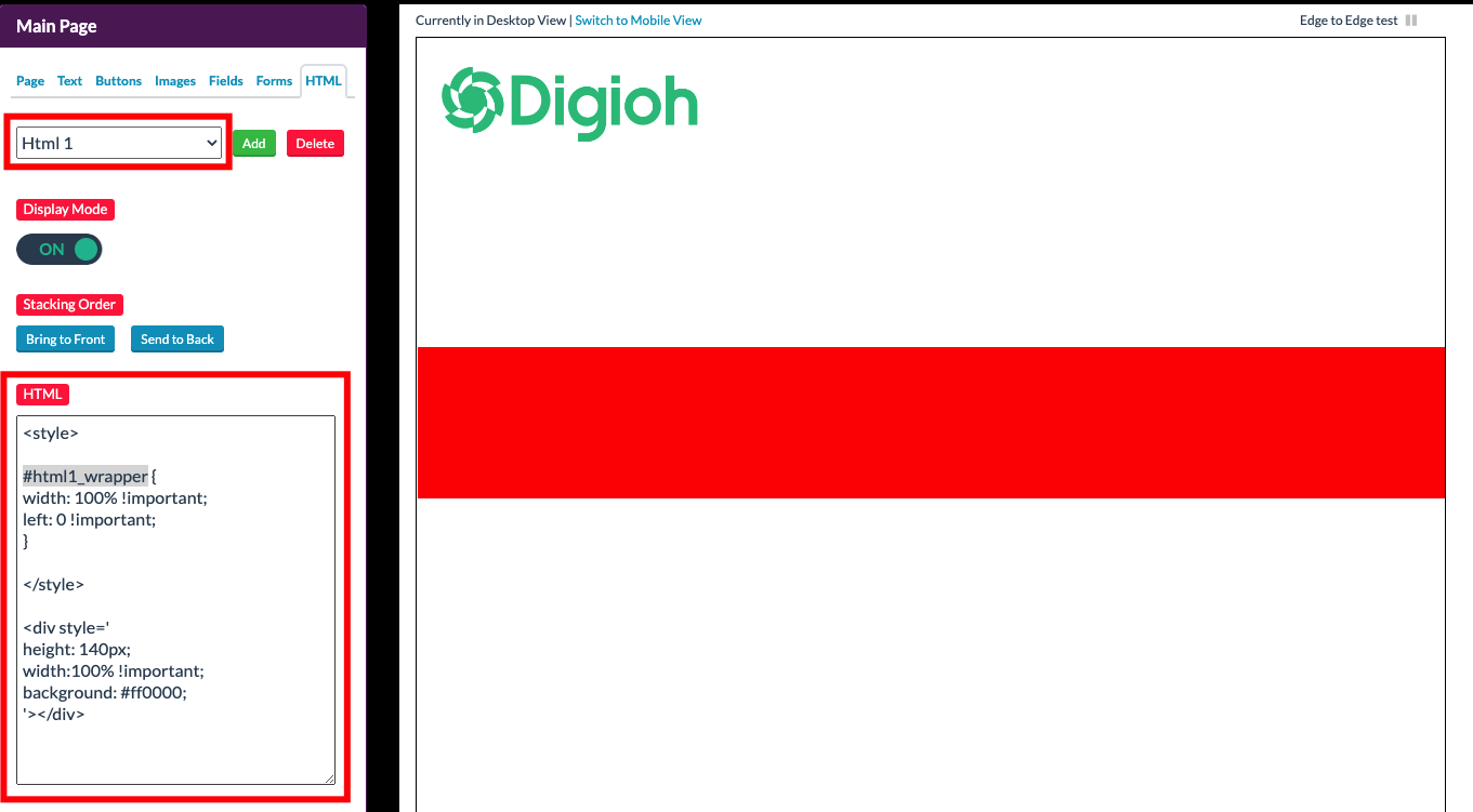
You will need to make sure the number in “#html1_wrapper” corresponds to the HTML block number you’re placing this code in.
Step 3: Edit the Height and Background color of the div section to the specifications you choose.
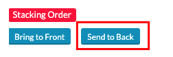
If this HTML block is covering any other elements, use the Send to Back button to move this to the background.
Use the Preview button to see the responsive section in action.
Creating a Background Image Block
When creating background image section that is responsive you will use similar steps as a color block, with additional CSS coding.
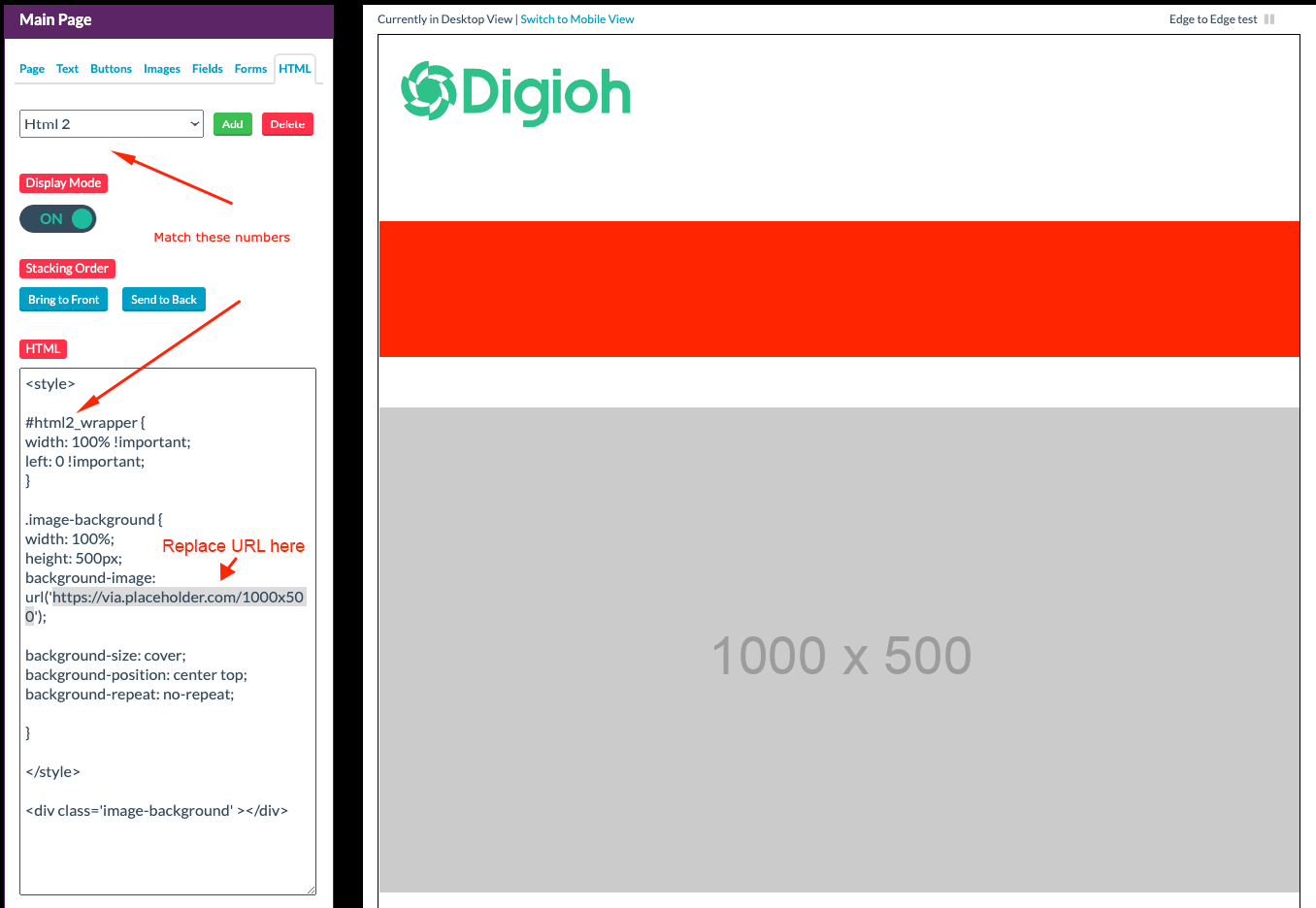
Step 1: Create a new HTML element like before and add in this code.
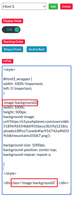
Remember to update the #htmlX_wrapper number to the number that matches the HTML element number.
<style>
#html2_wrapper {
width: 100% !important;
left: 0 !important;
}

.image-background {
width: 100%;
height: 500px;
background-image: url('https://via.placeholder.com/1000x500');

background-size: cover;
background-position: center top;
background-repeat: no-repeat;
}
</style>

<div class='image-background'></div>
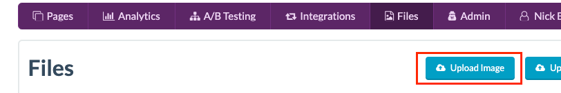
Step 2: Upload the photo you want to use into the Files section of the platform
Once that image is uploaded, click on the file name from the list which will open the image in a new URL.
Step 3: Copy the URL for that image and replace the placeholder URL between the parentheses of the “background-image:” CSS code.
Step 4: Once the image is in, you can update the CSS for sizing.
Example:
height:500px;
background-size: cover;
background-position: center top;
background-repeat: no-repeat;- Height: Set to the height of the image block
- Background-size: Setting the size to “cover” will allow it to stretch to any screen width.
(Note: It’s best to use a large or high resolution image, or you may risk pixelation on larger screen widths.) - Background-position: Choose the image position.
- Background-repeat: If you’re using a pattern you want to repeat, you can set “repeat” or “repeat-x” if you only want it to repeat horizontally.
(Note: You will also need to change “background-size” to the pixel width of the image instead of “cover” to allow it to repeat.)
Note: If using multiple Image Background HTML blocks, you will need to create a unique div class name for each, or one will override the other.
In this example, we’re using “image-background”. So if you’re creating multiple, you could create a new one called “image-background2,” etc.