Tactical Rundown
Purpose: Enable Digioh users to create rotating banner-style content that cycles through multiple pages in a single campaign, regardless of user interaction or idle time.
Use Cases:
- Promotional carousels
- Rotating featured products
- Multi-CTA banners
How it works: This extension uses metadata to control whether the carousel behavior is active, what pages are included, and how often the rotation should occur.
Configuration Steps
- Install the Extension from the extensions panel
- Go to Extensions
- Expand the menu and look for “Box carousel”
- Make sure to publish from the extensions panel to make the extension work live as well!
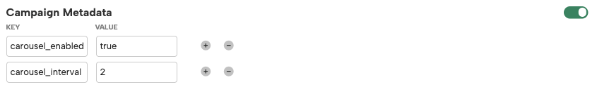
- Add Metadata to the Campaign:
carousel_enabled:true- Activates the carousel behavior.
carousel_interval:number(in seconds)- Sets the interval between page changes.
carousel_page:true(add this on each page you want included)- Identifies which pages should be part of the rotation.
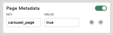
- Ensure Pages Are Created:
- Create all the pages you want included in the carousel within the same campaign (e.g.,
main,ep1,ep2). - Assign the
carousel_page: truemetadata to each one.
- Create all the pages you want included in the carousel within the same campaign (e.g.,
- Script Behavior:
- When
carousel_enabledis true, the extension:- Gathers all pages with
carousel_page: true - Sets a timer using
carousel_interval - Automatically rotates through the listed pages
- Loops back to the first page after the last one
- Gathers all pages with
- When
- Limitations:
- This version only supports page transitions within a single campaign.
- Cross-box transitions are not currently supported.
UI Controls and Dynamic Icons
You can enable interactive UI controls for your carousel (Next, Previous, Play, Pause) to help users navigate through the different pages in the campaign.
These controls are dynamically generated with JavaScript and can display emojis, icon font classes, or image URLs.
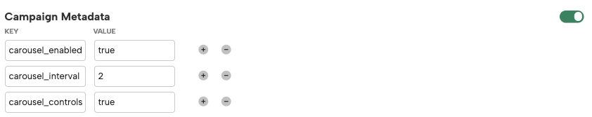
- Add Metadata to the Campaign:
carousel_controls:true- Activates the carousel’s UI controls.
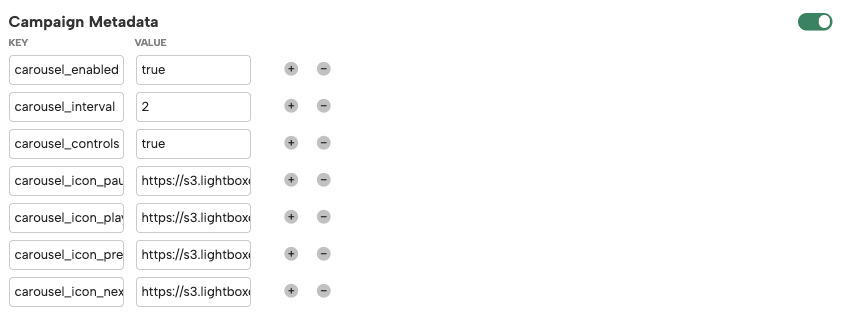
carousel_icon_prev:img sourcecarousel_icon_next:img sourcecarousel_icon_play:img sourcecarousel_icon_pause:img source- Defines the button icon for the control (Emoji, Font class, or Image URL).
- Example:
- carousel_icon_prev = ⬅️
- carousel_icon_next = ➡️
- carousel_icon_play = fas fa-play
- carousel_icon_pause = https://example.com/pause.svg
- Behavior:
- When the Next or Previous button is clicked, the carousel pauses automatically, and the pause icon switches to the play icon.
- If the carousel is paused and there is no user interaction for 20 seconds, it will resume playing automatically.
- If carousel_controls is not enabled, the carousel will operate as before (auto-rotation only, no UI controls).
Metadata Reference
| Key | Type | Description |
|---|---|---|
carousel_enabled |
boolean |
Enables the carousel behavior |
carousel_interval |
number |
Interval between transitions, in seconds |
carousel_page |
boolean |
Set to true on each page to include in rotation |
carousel_controls |
boolean |
Enables the carousel’s UI controls. When set to true, the navigation buttons will be injected dynamically. |
carousel_icon_prev |
string |
Define the Previous button icon (Emoji, Font class, or Image URL) |
carousel_icon_next |
string |
Define the Next button icon |
carousel_icon_play |
string |
Define the Play button icon |
carousel_icon_pause |
string |
Define the Pause button icon |
Notes
- The rotation does not rely on user inactivity.
- You can stop rotation by setting
carousel_enabledtofalse. - Works great for passive promotional displays.